Memphis Graphic Style vs Postmodern Graphic Design
Memphis Graphic Style was influenced by Postmodern Graphic Design — shared the postmodern revolt against modernist good taste, pushed toward pattern and play.

Memphis Graphic Style
The playful, anti-tasteful 1980s style born from Milan's Memphis Group — squiggles, confetti dots, zigzags, and clashing pastel-and-primary color against black.
- Squiggles, zigzags, and the signature 'Bacterio' scribble
- Confetti dots and terrazzo-speckle textures
- Clashing pastels and saturated primaries, often on black
- Bold geometric shapes in playful, scattered arrangements
- Decorative excess that rejects modernist restraint
Postmodern Graphic Design
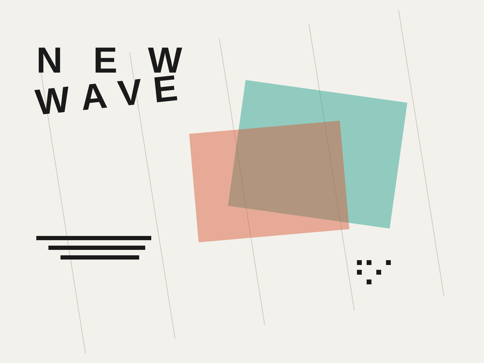
The rule-breaking reaction against rigid Swiss modernism, fracturing the grid with tilted type, layered transparency, and an embrace of complexity, ambiguity, and digital experimentation.
- Fractured grids with tilted and diagonal type axes
- Layered transparency and overlapping image planes
- Exaggerated, irregular letterspacing and stepped rules
- Early embrace of digital noise and Macintosh bitmap imagery
- Collision of disparate textures, patterns, and typefaces
At a glance
| Memphis Graphic Style | Postmodern Graphic Design | |
|---|---|---|
| Era | c. 1981–1990 | c. 1970s–1990s |
| Discipline | Graphic Design | Graphic Design |
| Region | Italy, United States | Switzerland, United States |
| Family | Postmodern, Vernacular/Pop | Postmodern, Digital |
| Formal traits | squiggle, confetti, clashing-color, geometric | layered, tilted-type, letterspaced, grid-breaking |
More comparisons
Advertisement