Memphis Graphic Style vs Swiss Style
Memphis Graphic Style arose as a reaction against Swiss Style — answered Swiss restraint with deliberately tasteless, decorative excess.

Memphis Graphic Style
The playful, anti-tasteful 1980s style born from Milan's Memphis Group — squiggles, confetti dots, zigzags, and clashing pastel-and-primary color against black.
- Squiggles, zigzags, and the signature 'Bacterio' scribble
- Confetti dots and terrazzo-speckle textures
- Clashing pastels and saturated primaries, often on black
- Bold geometric shapes in playful, scattered arrangements
- Decorative excess that rejects modernist restraint
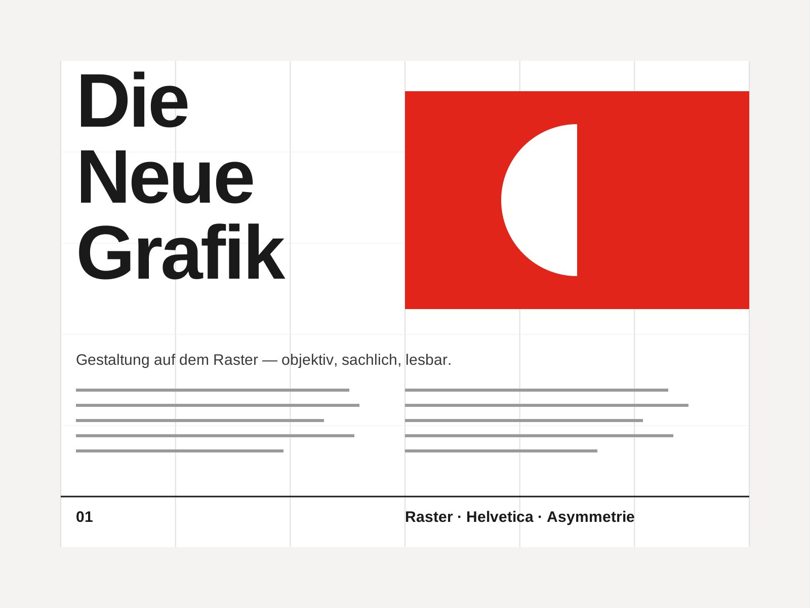
Swiss Style
The mid-century gospel of objective design — mathematical grids, flush-left ragged-right sans-serif type (Helvetica, Akzidenz-Grotesk), generous white space, and photography in place of illustration.
- Mathematical modular grid underlying every element
- Neo-grotesque sans-serif type (Helvetica, Akzidenz-Grotesk)
- Flush-left, ragged-right text setting
- Asymmetric layout balanced by generous white space
- Objective photography instead of illustration
At a glance
| Memphis Graphic Style | Swiss Style | |
|---|---|---|
| Era | c. 1981–1990 | 1950s–1970s |
| Discipline | Graphic Design | Graphic Design |
| Region | Italy, United States | Switzerland, Germany, International |
| Family | Postmodern, Vernacular/Pop | Modernist, International |
| Formal traits | squiggle, confetti, clashing-color, geometric | grid-based, sans-serif, asymmetric, minimal |
More comparisons
Advertisement