Optima vs Trajan
Optima was influenced by Trajan — drawn from the Roman inscriptional capital tradition.

Optima
Hermann Zapf's 1958 'serifless roman' — a humanist sans whose stems gently flare toward their ends, splitting the difference between sans and serif. Inspired by lettering Zapf sketched on Florentine grave slabs.
- Serifless stems that flare gently at the terminals
- Tapered 'waisted' strokes with modulated, swelling contrast
- Classical Roman capital proportions of varied width
- Calligraphic stress recalling chiselled inscriptional letters
- No bracketed serifs, yet clear thick/thin modulation
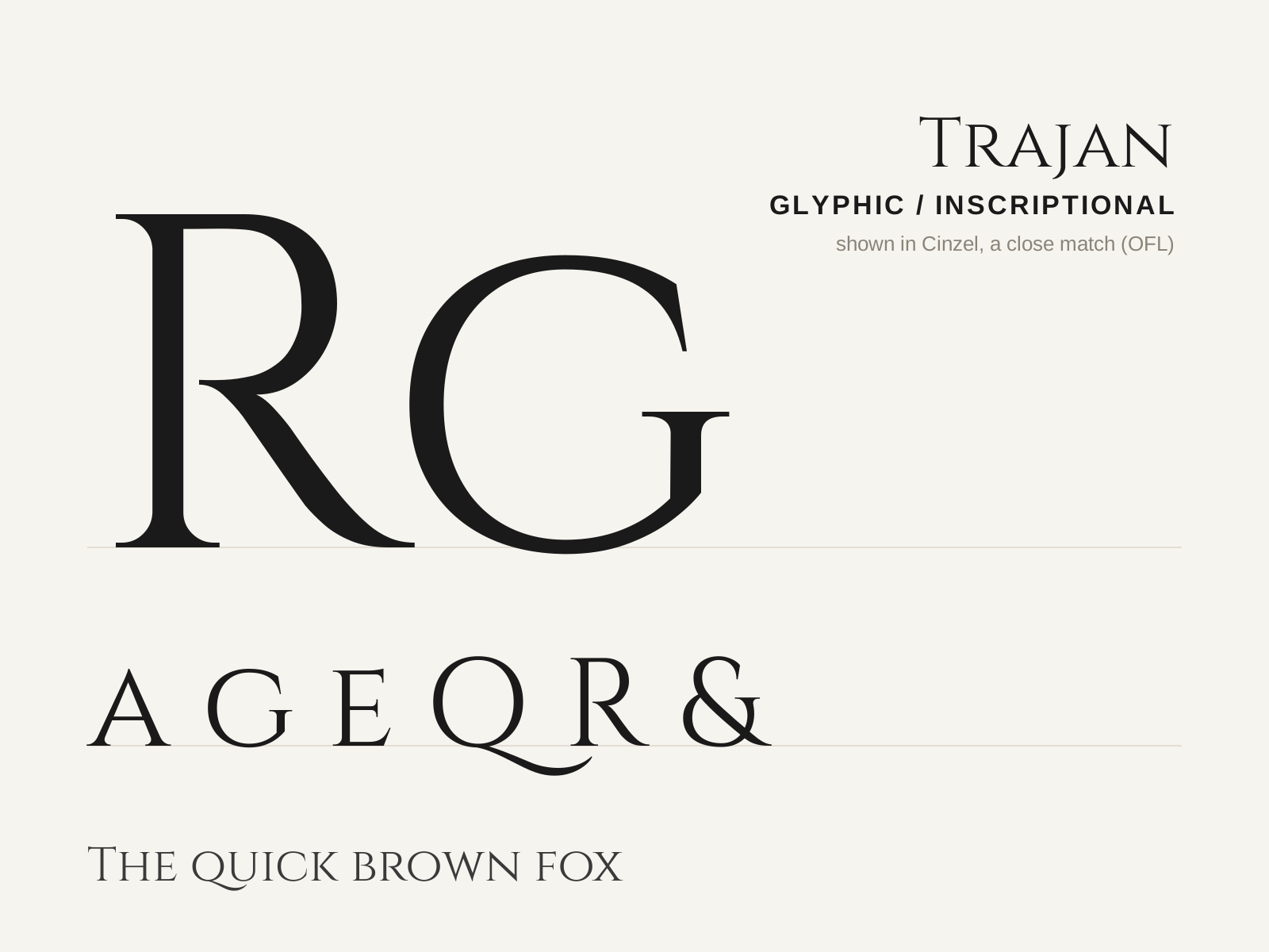
Trajan
Carol Twombly's 1989 all-capitals titling face, drawn after the Roman inscription at the base of Trajan's Column. Monumental, classical, and inescapable on film posters and book jackets.
- Capitals only — no lowercase
- Small, triangular, flaring (incised) serifs
- Moderate contrast with subtly modelled strokes
- Classical Roman inscriptional proportions
- Wide R with a long, gracefully curving leg
At a glance
| Optima | Trajan | |
|---|---|---|
| Era | 1958 | 1989 |
| Discipline | Typography | Typography |
| Region | Germany | United States |
| Family | Humanist Sans, Glyphic | Serif |
| Formal traits | flared-stems, modulated-contrast, calligraphic, serifless | glyphic, incised, flared-terminal, low-contrast |
More comparisons
Advertisement