Psychedelic Poster Art vs Swiss Style
Psychedelic Poster Art arose as a reaction against Swiss Style — rejected Swiss legibility and neutrality for immersive, subjective sensation.
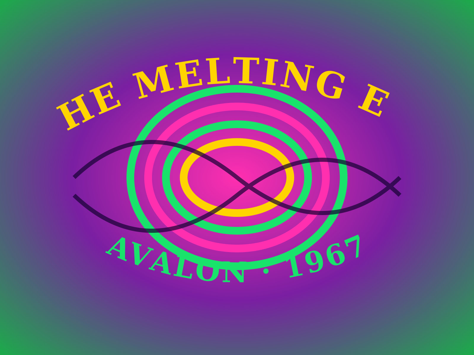
Psychedelic Poster Art
The hallucinatory concert-poster style of 1960s San Francisco, built on vibrating complementary colors, melting hand-lettering you can barely read, and swirling Art Nouveau revival forms.
- Vibrating complementary colors placed edge to edge
- Melting, hand-drawn lettering bent to fill the composition
- Sinuous Art Nouveau and Vienna Secession revival curves
- Dense, all-over compositions with little empty space
- Deliberately challenging, near-illegible typography
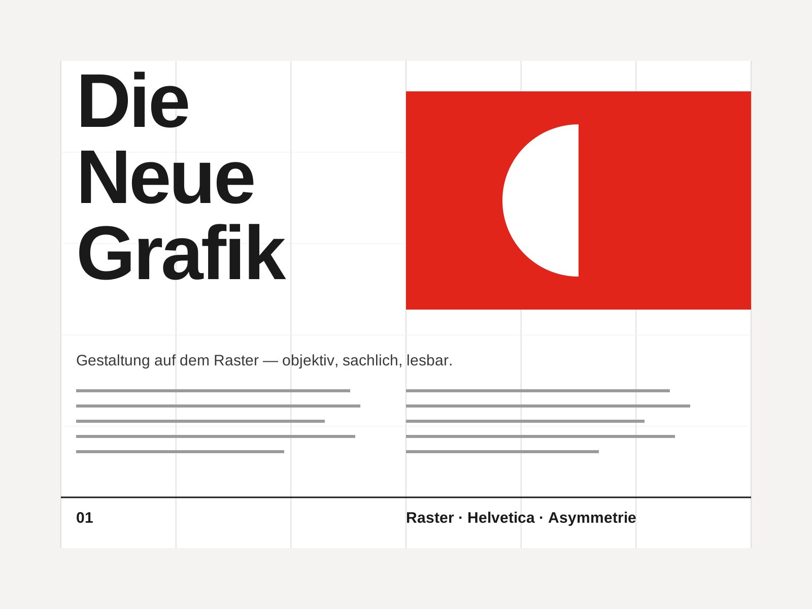
Swiss Style
The mid-century gospel of objective design — mathematical grids, flush-left ragged-right sans-serif type (Helvetica, Akzidenz-Grotesk), generous white space, and photography in place of illustration.
- Mathematical modular grid underlying every element
- Neo-grotesque sans-serif type (Helvetica, Akzidenz-Grotesk)
- Flush-left, ragged-right text setting
- Asymmetric layout balanced by generous white space
- Objective photography instead of illustration
At a glance
| Psychedelic Poster Art | Swiss Style | |
|---|---|---|
| Era | c. 1966–1971 | 1950s–1970s |
| Discipline | Graphic Design | Graphic Design |
| Region | United States | Switzerland, Germany, International |
| Family | Vernacular/Pop, Counterculture | Modernist, International |
| Formal traits | hand-lettering, vibrating-color, art-nouveau-revival, dense-composition | grid-based, sans-serif, asymmetric, minimal |
More comparisons
Advertisement