Skate Graphics vs Swiss Style
Skate Graphics arose as a reaction against Swiss Style.
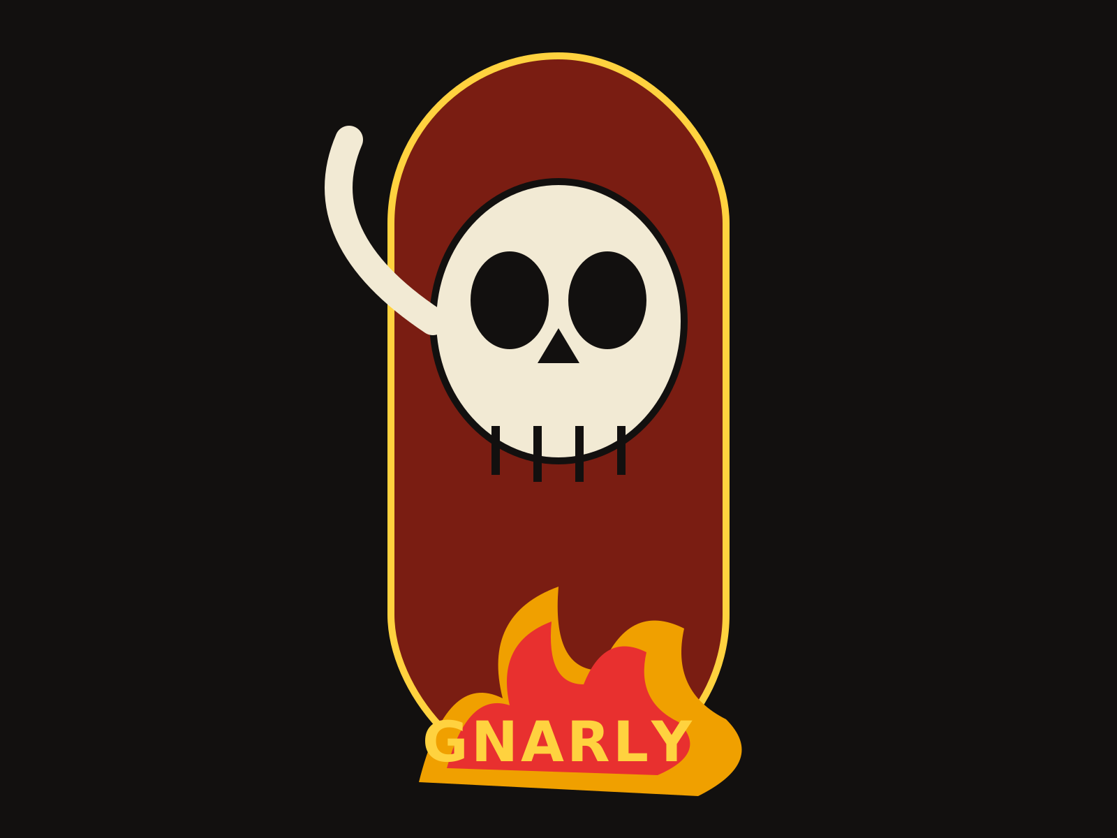
Skate Graphics
The bold, gnarly illustration of skateboard decks and skate zines—screaming skulls, dragons, and cartoon mayhem rendered with heavy outlines and high-contrast punch.
- Heavy black ink outlines around figures
- Lurid skulls, monsters, dragons, and claws
- High-contrast flat color fills
- Aggressive hand-lettered logotypes
- Horror-comic and hot-rod illustration influence
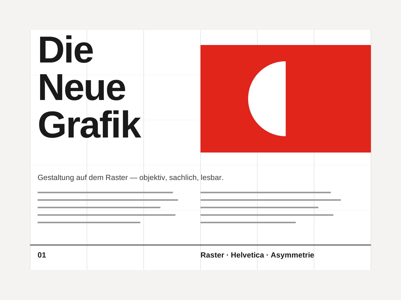
Swiss Style
The mid-century gospel of objective design — mathematical grids, flush-left ragged-right sans-serif type (Helvetica, Akzidenz-Grotesk), generous white space, and photography in place of illustration.
- Mathematical modular grid underlying every element
- Neo-grotesque sans-serif type (Helvetica, Akzidenz-Grotesk)
- Flush-left, ragged-right text setting
- Asymmetric layout balanced by generous white space
- Objective photography instead of illustration
At a glance
| Skate Graphics | Swiss Style | |
|---|---|---|
| Era | 1970s–present | 1950s–1970s |
| Discipline | Graphic Design | Graphic Design |
| Region | United States, Global | Switzerland, Germany, International |
| Family | DIY/Subculture, Vernacular/Pop | Modernist, International |
| Formal traits | hand-drawn, bold-outline, illustrative, high-contrast | grid-based, sans-serif, asymmetric, minimal |
More comparisons
Advertisement