The New Typography vs Swiss Style
Swiss Style evolved from The New Typography — carried Tschichold's New Typography forward into a rigorous, total grid system.
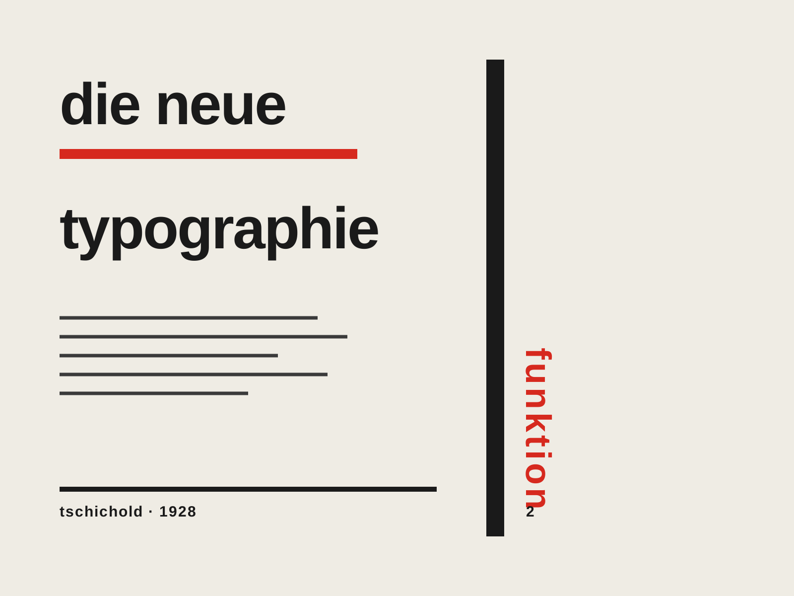
The New Typography
The rigorous modernist program codified by Jan Tschichold — asymmetric layouts, sans-serif type, and the functional grid presented not as art but as a rational set of rules for clear, efficient communication.
- Asymmetric, left-aligned layout replacing centered composition
- Sans-serif (grotesque) type as the modern standard
- Functional grid where every element earns its place
- Active white space and rules directing the eye
- Standardized formats and integration of photography
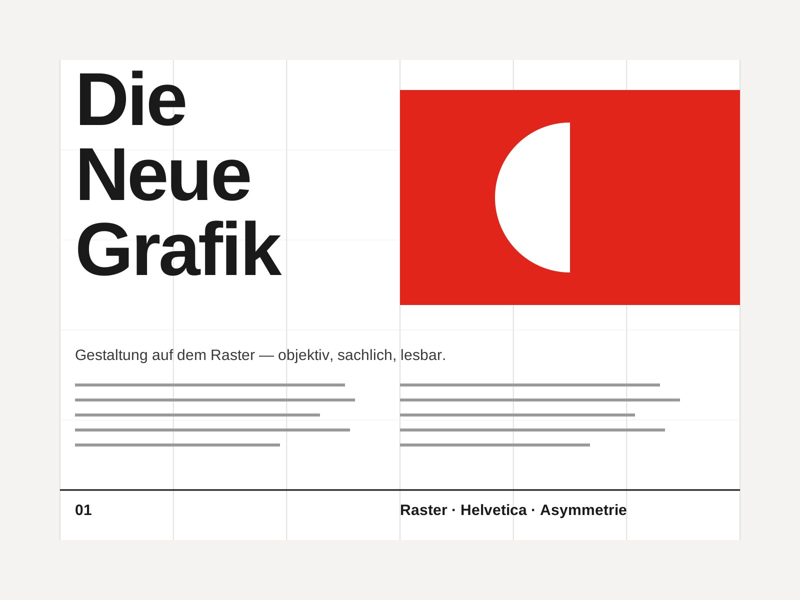
Swiss Style
The mid-century gospel of objective design — mathematical grids, flush-left ragged-right sans-serif type (Helvetica, Akzidenz-Grotesk), generous white space, and photography in place of illustration.
- Mathematical modular grid underlying every element
- Neo-grotesque sans-serif type (Helvetica, Akzidenz-Grotesk)
- Flush-left, ragged-right text setting
- Asymmetric layout balanced by generous white space
- Objective photography instead of illustration
At a glance
| The New Typography | Swiss Style | |
|---|---|---|
| Era | 1925–1935 | 1950s–1970s |
| Discipline | Graphic Design | Graphic Design |
| Region | Germany, Switzerland | Switzerland, Germany, International |
| Family | Modernism, Typography | Modernist, International |
| Formal traits | asymmetric, sans-serif, grid-based, functional | grid-based, sans-serif, asymmetric, minimal |
More comparisons
Advertisement