Baskerville vs Bodoni
Bodoni was influenced by Baskerville — pushed Baskerville's contrast to the limit.
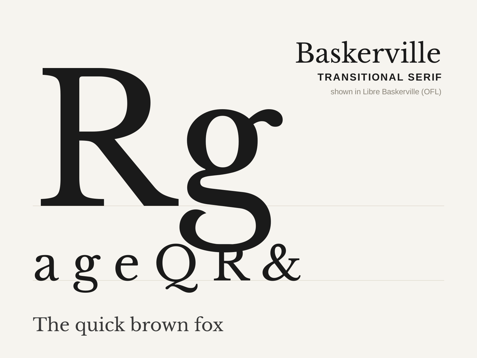
Baskerville
John Baskerville's 1757 transitional serif — crisper and higher in contrast than the old-styles, with a near-vertical stress and sparkling sharp serifs, printed on his own glossy paper with blacker ink.
- Higher contrast than old-style, near-vertical stress
- Crisp, sharply finished bracketed serifs
- Open lowercase 'g' with an unclosed lower loop
- Flourished tail on the capital 'Q'
- Teardrop terminals on a, c, f
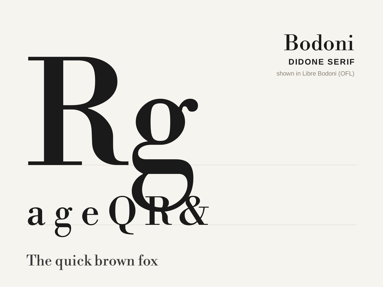
Bodoni
Giambattista Bodoni's late-eighteenth-century Didone — extreme contrast, a strictly vertical axis, and flat hairline serifs that 'dazzle' on the page. The face of luxury, fashion, and Empire elegance.
- Extreme contrast between heavy stems and hairline thins
- Strictly vertical axis of stress
- Flat, thin, unbracketed serifs
- Ball terminals on a, c, f, r
- Crisp, vertical, geometric proportions
At a glance
| Baskerville | Bodoni | |
|---|---|---|
| Era | 1757 | 1790s |
| Discipline | Typography | Typography |
| Region | England, Birmingham | Italy, Parma |
| Family | Serif | Serif |
| Formal traits | transitional, bracketed-serif, vertical-stress, high-contrast | didone, high-contrast, vertical-stress, unbracketed |
More comparisons
Advertisement