Baskerville vs Caslon
Baskerville was influenced by Caslon.
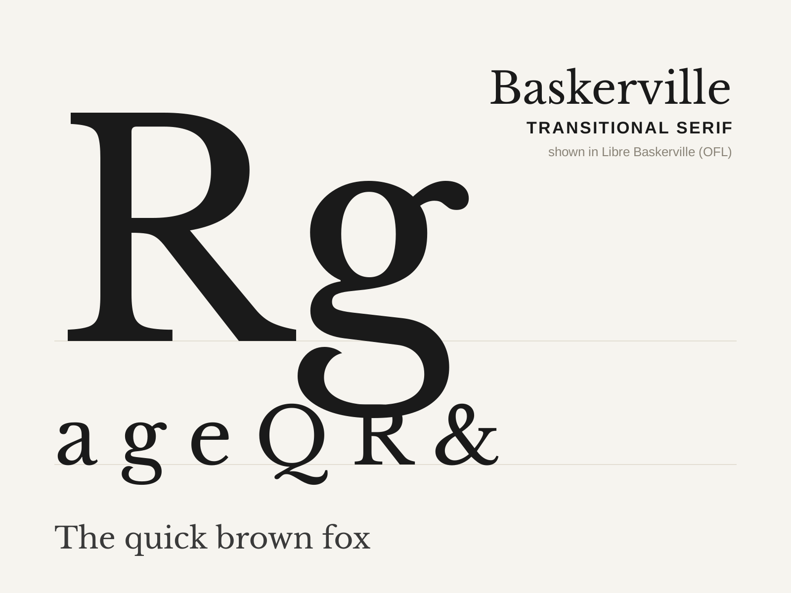
Baskerville
John Baskerville's 1757 transitional serif — crisper and higher in contrast than the old-styles, with a near-vertical stress and sparkling sharp serifs, printed on his own glossy paper with blacker ink.
- Higher contrast than old-style, near-vertical stress
- Crisp, sharply finished bracketed serifs
- Open lowercase 'g' with an unclosed lower loop
- Flourished tail on the capital 'Q'
- Teardrop terminals on a, c, f
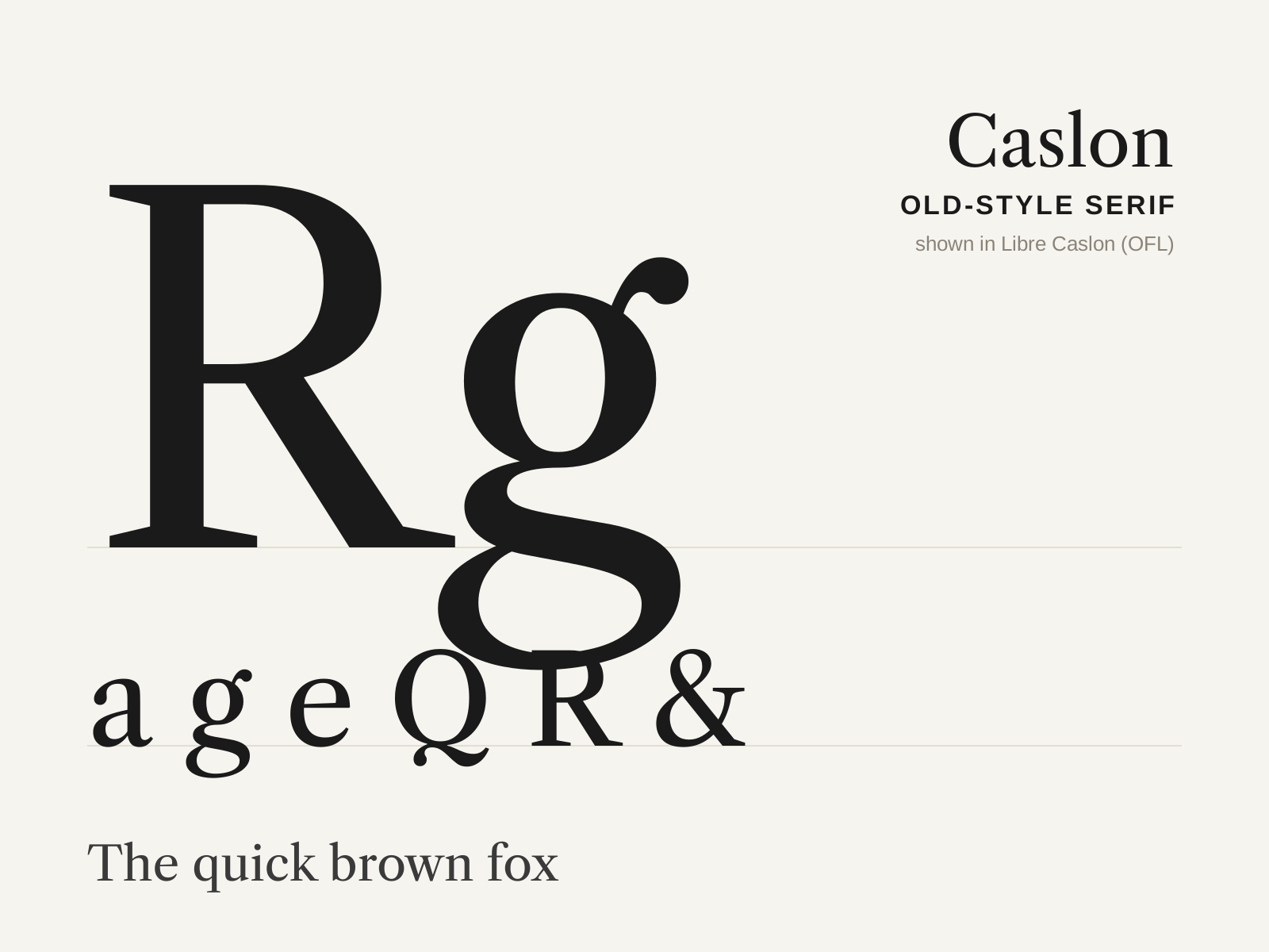
Caslon
William Caslon's sturdy English old-style of the 1720s — slightly irregular, immensely practical, and so trustworthy it set the U.S. Declaration of Independence. 'When in doubt, use Caslon.'
- Moderate contrast, inclined-to-near-vertical stress
- Sturdy bracketed serifs, slightly irregular fit
- High-waisted capital A with a pointed apex
- Robust, comfortable, even text color
- Lively, somewhat irregular italic
At a glance
| Baskerville | Caslon | |
|---|---|---|
| Era | 1757 | 1722 |
| Discipline | Typography | Typography |
| Region | England, Birmingham | England, London |
| Family | Serif | Serif |
| Formal traits | transitional, bracketed-serif, vertical-stress, high-contrast | old-style, bracketed-serif, oblique-stress, moderate-contrast |
More comparisons
Advertisement