Baskerville vs Transitional Serif
Baskerville evolved from Transitional Serif — the archetype of the transitional serif.
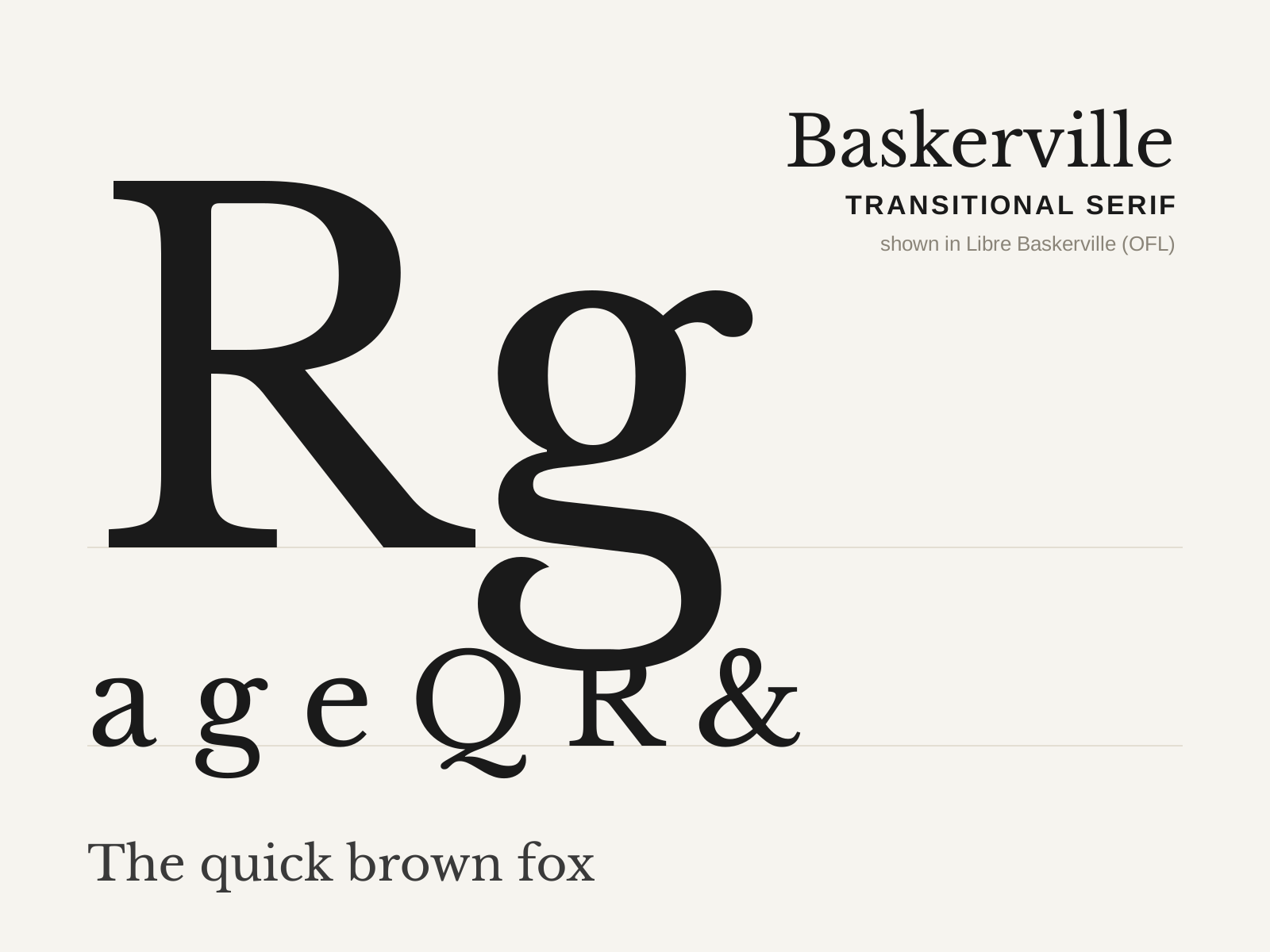
Baskerville
John Baskerville's 1757 transitional serif — crisper and higher in contrast than the old-styles, with a near-vertical stress and sparkling sharp serifs, printed on his own glossy paper with blacker ink.
- Higher contrast than old-style, near-vertical stress
- Crisp, sharply finished bracketed serifs
- Open lowercase 'g' with an unclosed lower loop
- Flourished tail on the capital 'Q'
- Teardrop terminals on a, c, f
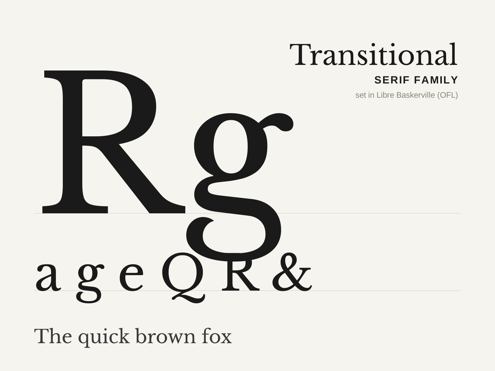
Transitional Serif
The bridge between the pen-formed old-styles and the rationalist Didones. Contrast sharpens and the axis swings toward vertical, yielding crisper, more even letterforms still warmed by bracketed serifs.
- Medium-to-high stroke contrast
- Near-vertical (slightly inclined) axis of stress
- Crisp, refined bracketed serifs
- More even, regular letter proportions than old-style
- Teardrop or sheared terminals on a, c, f
At a glance
| Baskerville | Transitional Serif | |
|---|---|---|
| Era | 1757 | 1690s–1790s |
| Discipline | Typography | Typography |
| Region | England, Birmingham | France, England |
| Family | Serif | Serif |
| Formal traits | transitional, bracketed-serif, vertical-stress, high-contrast | transitional, bracketed-serif, vertical-stress, high-contrast |
More comparisons
Advertisement