Baskerville vs Times New Roman
Times New Roman was influenced by Baskerville.
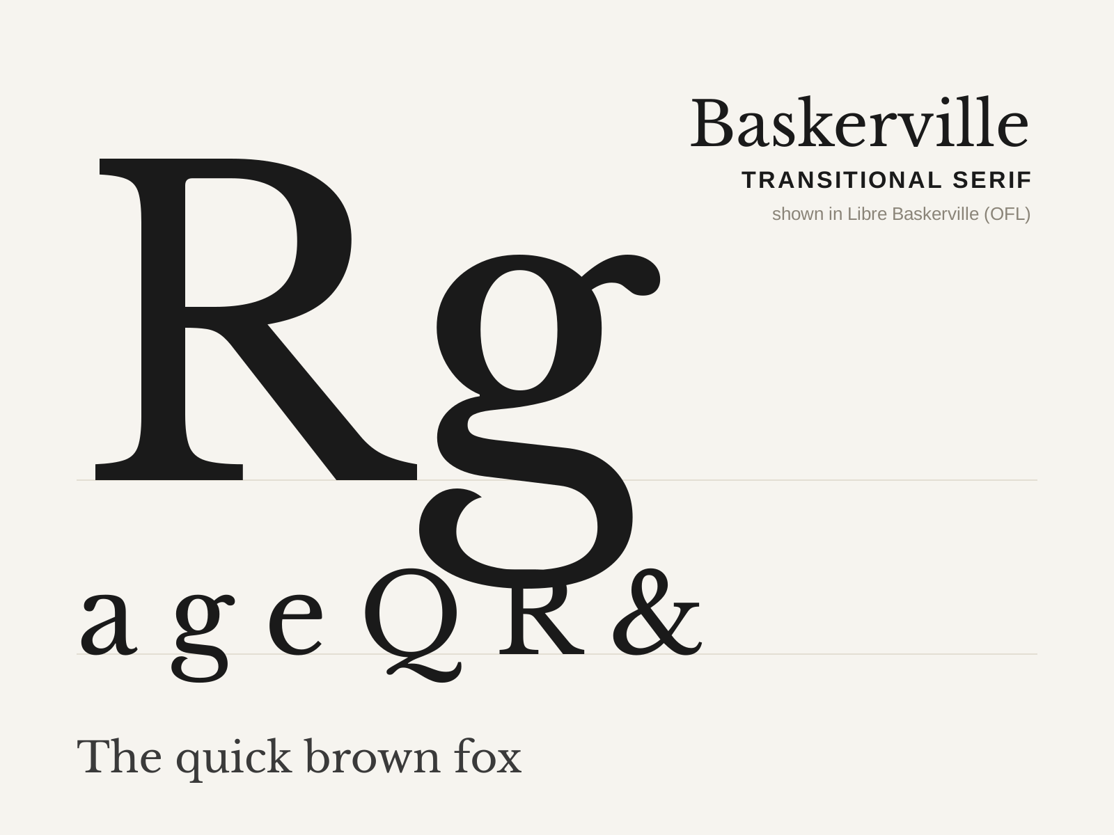
Baskerville
John Baskerville's 1757 transitional serif — crisper and higher in contrast than the old-styles, with a near-vertical stress and sparkling sharp serifs, printed on his own glossy paper with blacker ink.
- Higher contrast than old-style, near-vertical stress
- Crisp, sharply finished bracketed serifs
- Open lowercase 'g' with an unclosed lower loop
- Flourished tail on the capital 'Q'
- Teardrop terminals on a, c, f
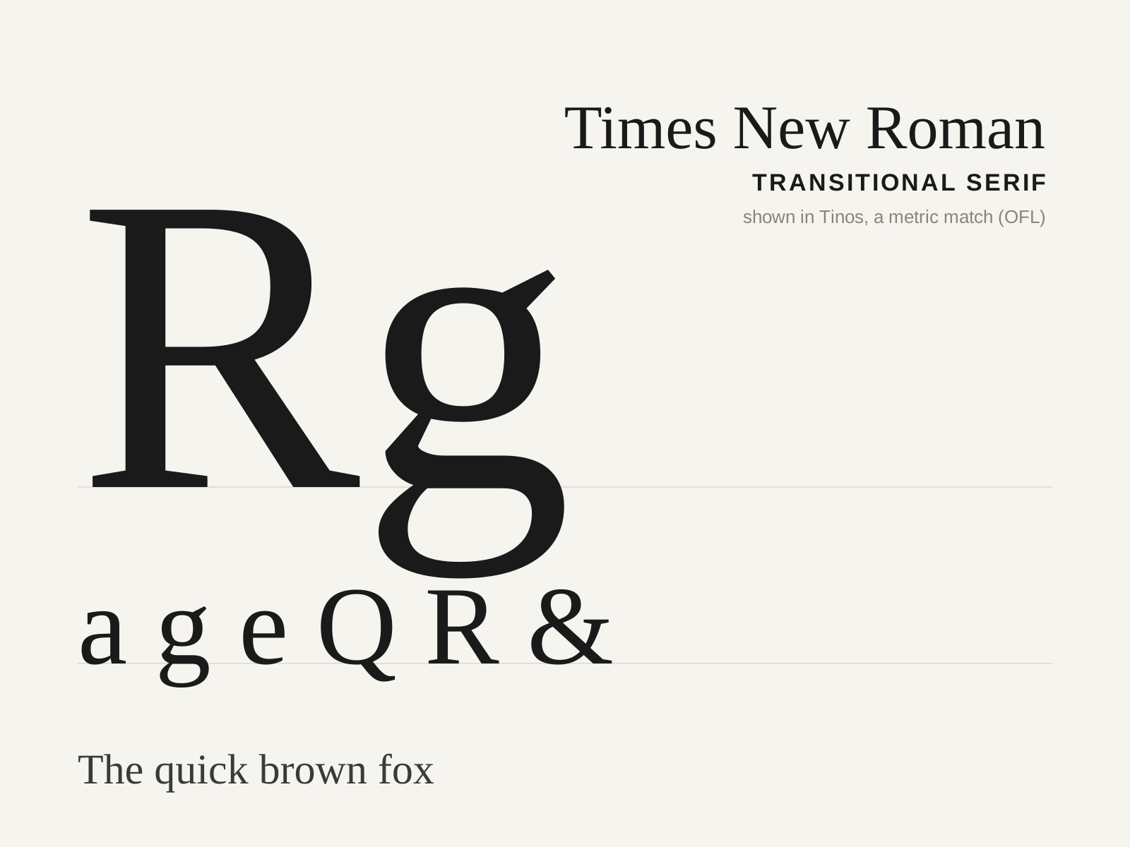
Times New Roman
The 1932 newspaper face commissioned for The Times of London under Stanley Morison and drawn by Victor Lardent — a compact, sharp, economical transitional serif that became the twentieth century's default.
- Relatively high contrast, near-vertical stress
- Sharp, pointed bracketed serifs
- Large x-height with condensed proportions
- Compact, economical character widths
- Sturdy, crisp forms tuned for small sizes
At a glance
| Baskerville | Times New Roman | |
|---|---|---|
| Era | 1757 | 1932 |
| Discipline | Typography | Typography |
| Region | England, Birmingham | England, London |
| Family | Serif | Serif |
| Formal traits | transitional, bracketed-serif, vertical-stress, high-contrast | transitional, bracketed-serif, vertical-stress, high-contrast |
More comparisons
Advertisement