Courier vs Space Mono
Space Mono was influenced by Courier.
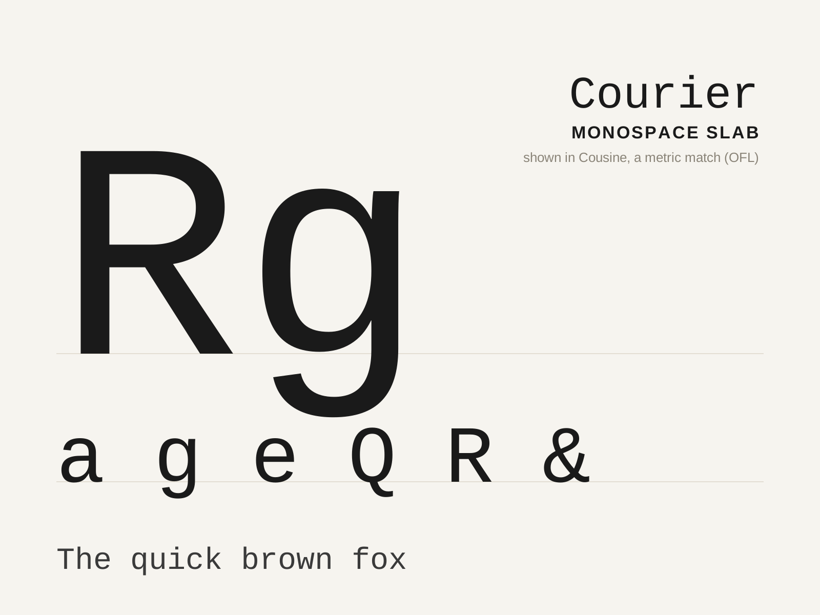
Courier
The slab-serifed monospace designed for IBM typewriters in 1955, so ubiquitous it became the visual default of the typewritten page — and, by industry decree, of the screenplay. Every glyph marches at the same fixed width.
- Fixed monospaced width across all glyphs
- Blunt slab serifs padding narrow letters
- Low stroke contrast for ribbon-impact durability
- Open counters and sturdy, even forms
- Wide, generous letter spacing
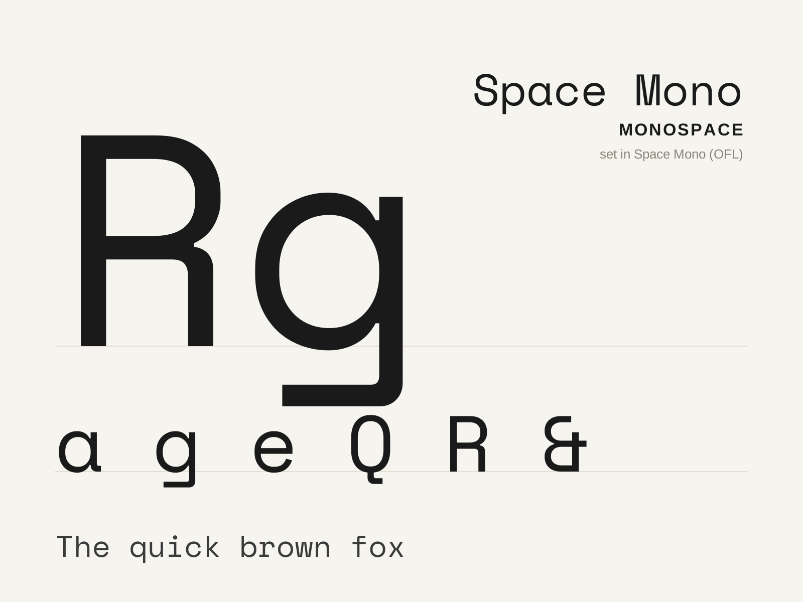
Space Mono
A fixed-width display monospace from Colophon Foundry, blending mid-century sci-fi quirk with a retro-futurist swagger. Distinctive ball terminals and angular details give the rigid grid an unmistakable personality.
- Fixed monospaced width with display-scale personality
- Bulbous ball terminals on several letters
- Sharp angular cuts at stroke junctions
- Retro-futurist, mid-century sci-fi detailing
- Pronounced contrast unusual for a monospace
At a glance
| Courier | Space Mono | |
|---|---|---|
| Era | 1955–present | 2016–present |
| Discipline | Typography | Typography |
| Region | United States, Global | United Kingdom, Global |
| Family | Monospace | Monospace |
| Formal traits | monospaced, fixed-width, slab-serif, low-contrast | monospaced, fixed-width, display, ball-terminals |
More comparisons
Advertisement