Courier vs Slab Serif
Courier was influenced by Slab Serif — a slab-serifed fixed-width design.
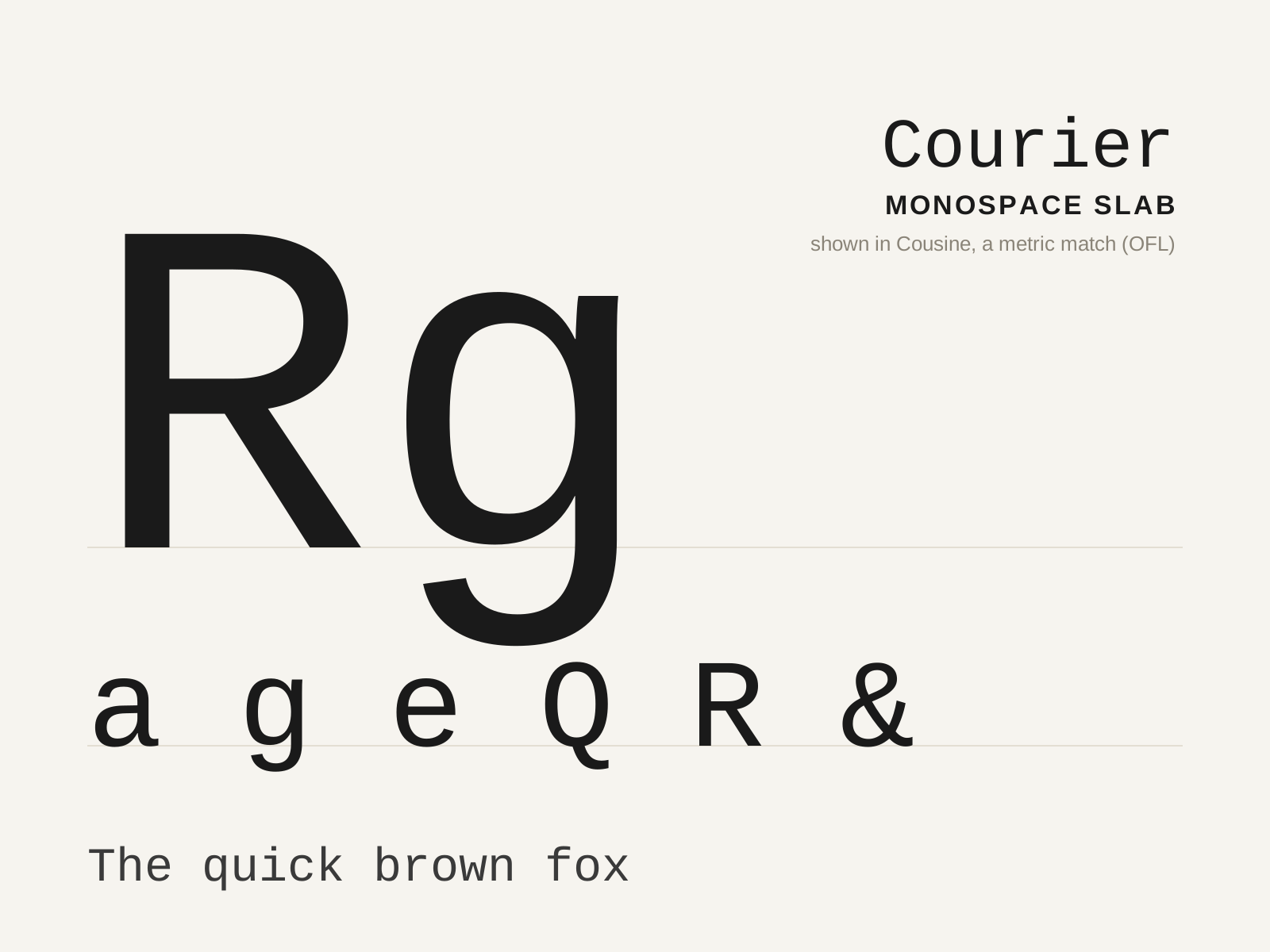
Courier
The slab-serifed monospace designed for IBM typewriters in 1955, so ubiquitous it became the visual default of the typewritten page — and, by industry decree, of the screenplay. Every glyph marches at the same fixed width.
- Fixed monospaced width across all glyphs
- Blunt slab serifs padding narrow letters
- Low stroke contrast for ribbon-impact durability
- Open counters and sturdy, even forms
- Wide, generous letter spacing
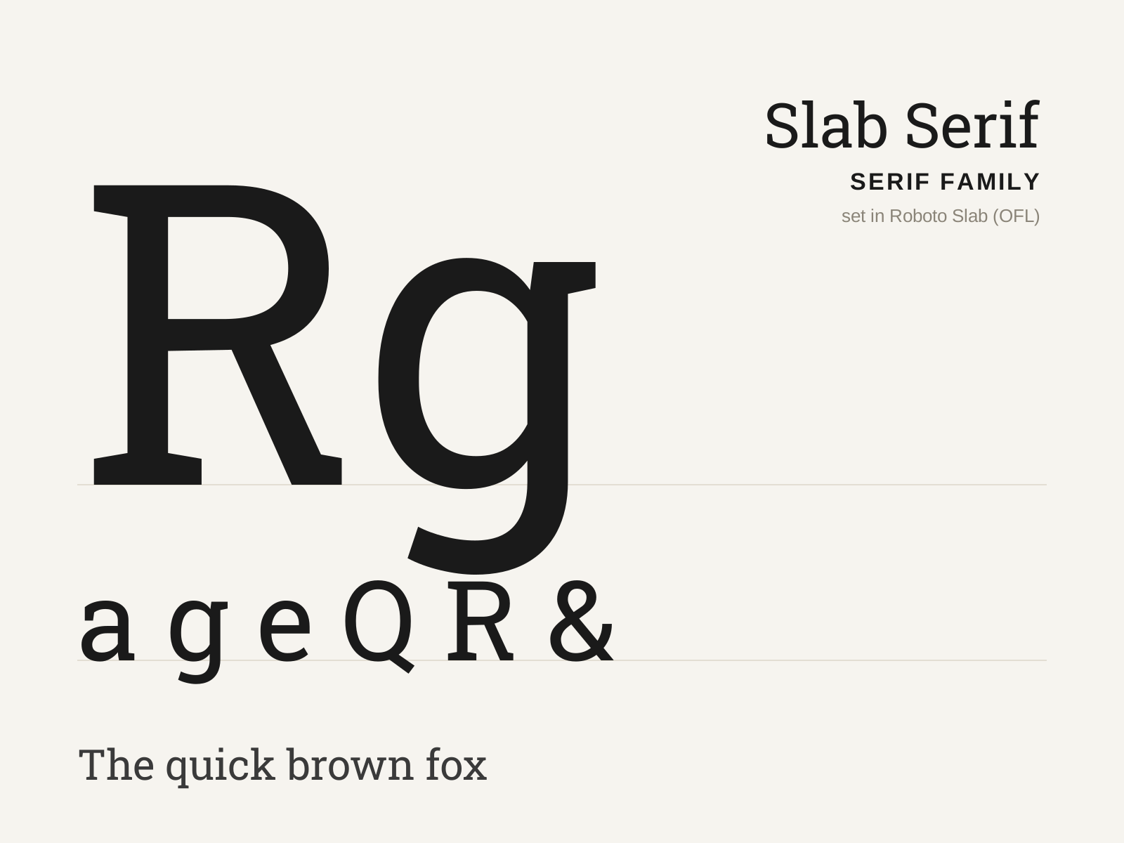
Slab Serif
Heavy, blocky serifs as thick as the stems, born for the bold demands of nineteenth-century advertising. Low contrast and squared-off, it shouts where the Didone whispers.
- Thick, square serifs nearly equal in weight to the stems
- Low stroke contrast, often near-monoline
- Bracketed (Clarendon) or unbracketed (geometric) serif joins
- Sturdy, even, mechanical proportions
- Large x-height with robust, blocky color
At a glance
| Courier | Slab Serif | |
|---|---|---|
| Era | 1955–present | 1810s–1840s |
| Discipline | Typography | Typography |
| Region | United States, Global | England, United States |
| Family | Monospace | Serif |
| Formal traits | monospaced, fixed-width, slab-serif, low-contrast | slab-serif, low-contrast, monoline, vertical-stress |
More comparisons
Advertisement