Courier vs Monospace
Courier evolved from Monospace — the archetypal typewriter monospace.
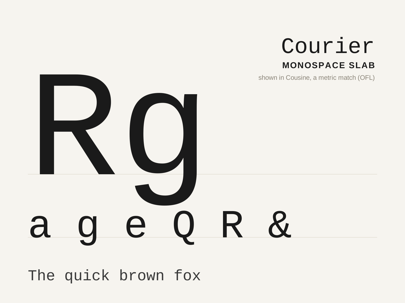
Courier
The slab-serifed monospace designed for IBM typewriters in 1955, so ubiquitous it became the visual default of the typewritten page — and, by industry decree, of the screenplay. Every glyph marches at the same fixed width.
- Fixed monospaced width across all glyphs
- Blunt slab serifs padding narrow letters
- Low stroke contrast for ribbon-impact durability
- Open counters and sturdy, even forms
- Wide, generous letter spacing
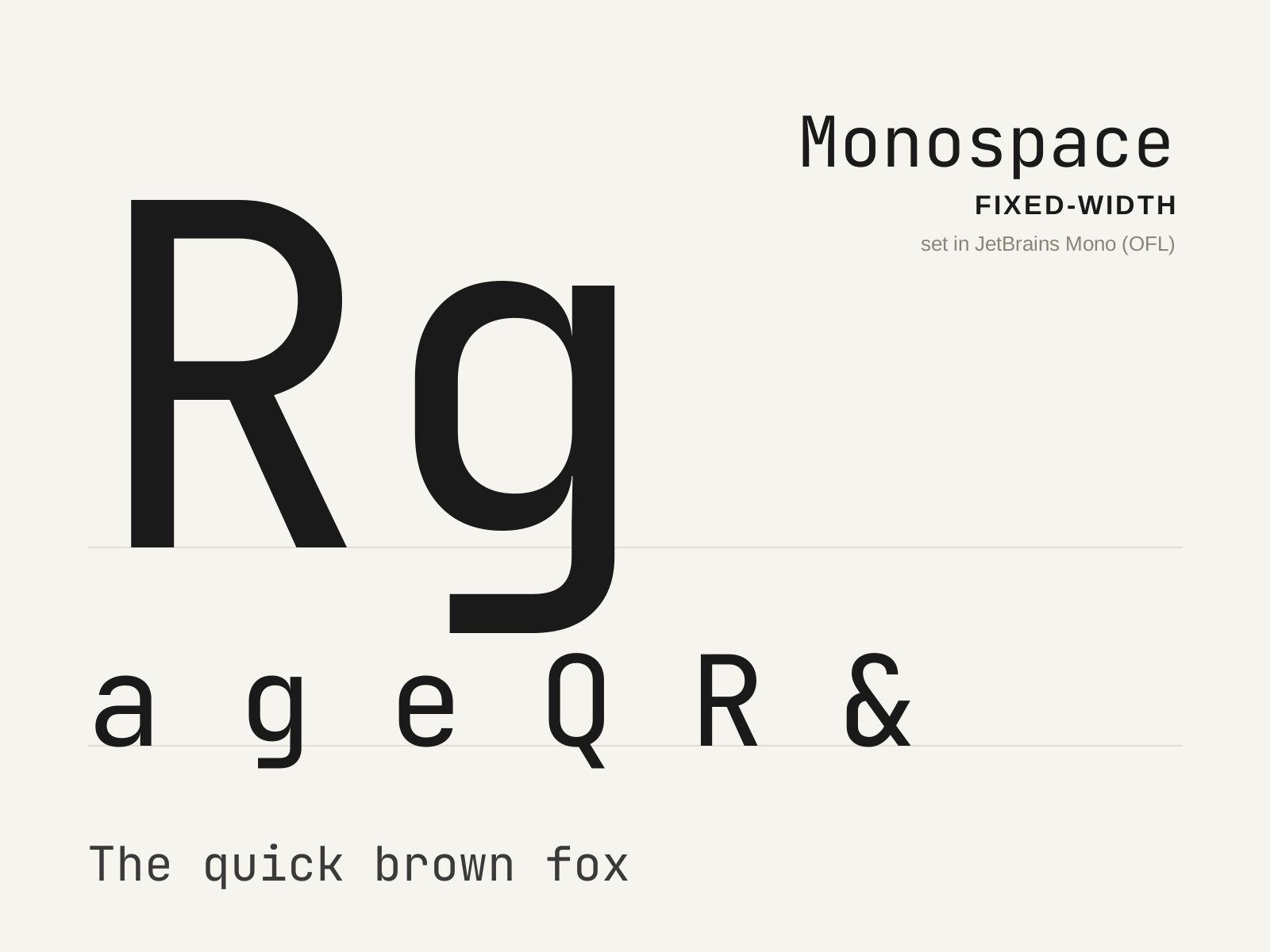
Monospace
The family in which every glyph occupies an identical horizontal width, descended from the mechanical typewriter and now the default voice of code. A narrow 'i' and a wide 'm' share the same cell, forcing distinctive design compromises.
- Every glyph advances an identical fixed width
- Wide spurs and serifs padding naturally narrow letters
- Condensed forms for naturally wide letters
- Strongly differentiated confusable characters
- Even horizontal rhythm aligning into columns
At a glance
| Courier | Monospace | |
|---|---|---|
| Era | 1955–present | c. 1870–present |
| Discipline | Typography | Typography |
| Region | United States, Global | United States, Global |
| Family | Monospace | Monospace |
| Formal traits | monospaced, fixed-width, slab-serif, low-contrast | monospaced, fixed-width, even-rhythm, mechanical |
More comparisons
Advertisement