Monospace vs Space Mono
Space Mono evolved from Monospace.
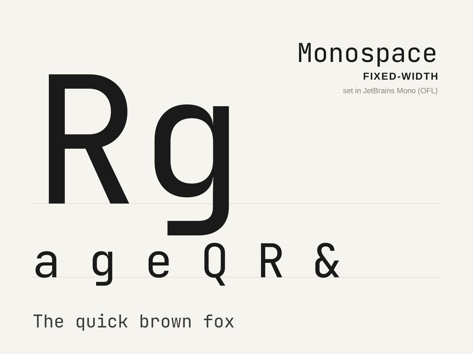
Monospace
The family in which every glyph occupies an identical horizontal width, descended from the mechanical typewriter and now the default voice of code. A narrow 'i' and a wide 'm' share the same cell, forcing distinctive design compromises.
- Every glyph advances an identical fixed width
- Wide spurs and serifs padding naturally narrow letters
- Condensed forms for naturally wide letters
- Strongly differentiated confusable characters
- Even horizontal rhythm aligning into columns
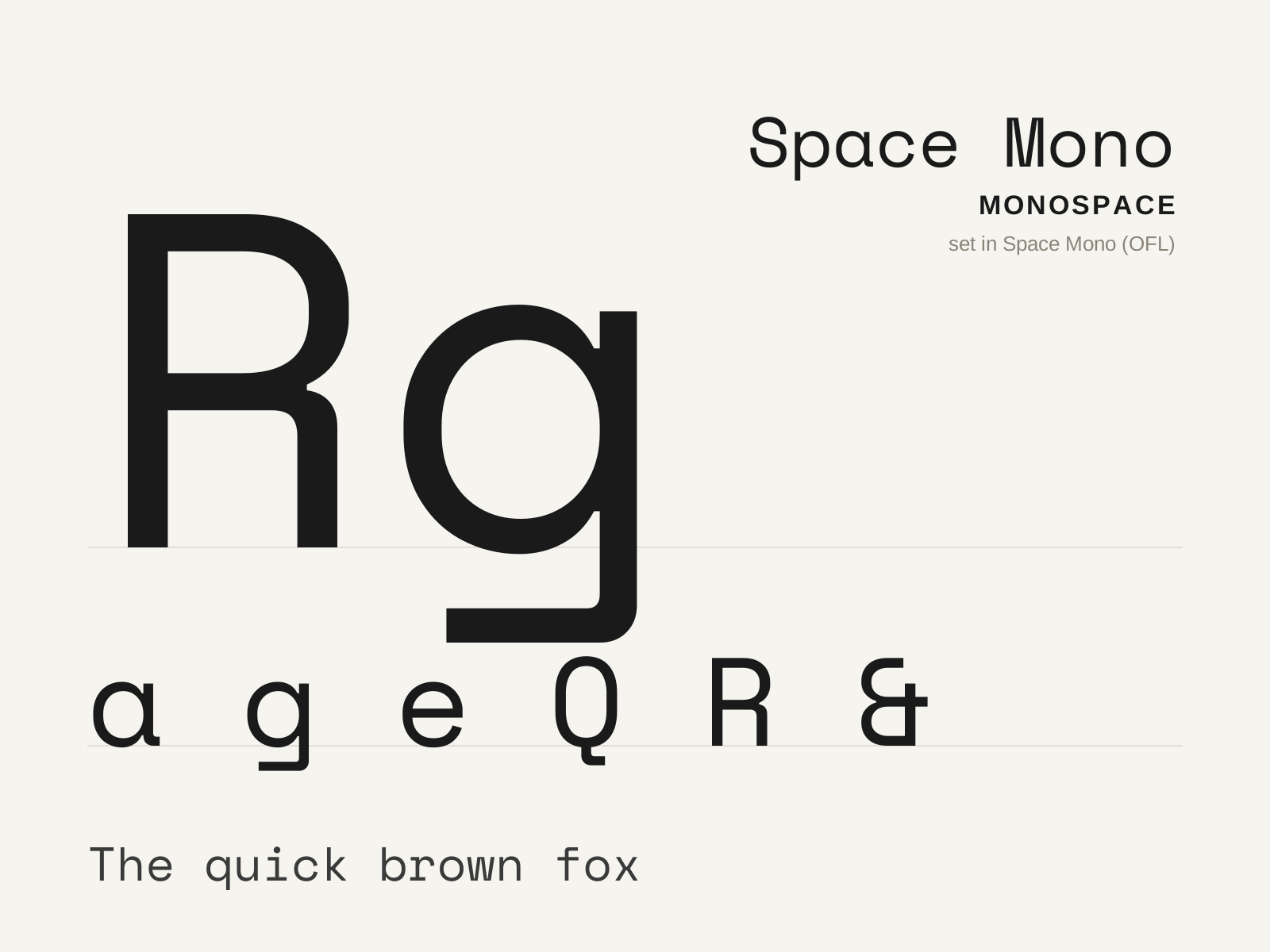
Space Mono
A fixed-width display monospace from Colophon Foundry, blending mid-century sci-fi quirk with a retro-futurist swagger. Distinctive ball terminals and angular details give the rigid grid an unmistakable personality.
- Fixed monospaced width with display-scale personality
- Bulbous ball terminals on several letters
- Sharp angular cuts at stroke junctions
- Retro-futurist, mid-century sci-fi detailing
- Pronounced contrast unusual for a monospace
At a glance
| Monospace | Space Mono | |
|---|---|---|
| Era | c. 1870–present | 2016–present |
| Discipline | Typography | Typography |
| Region | United States, Global | United Kingdom, Global |
| Family | Monospace | Monospace |
| Formal traits | monospaced, fixed-width, even-rhythm, mechanical | monospaced, fixed-width, display, ball-terminals |
More comparisons
Advertisement