Flat Design vs Glassmorphism
Glassmorphism evolved from Flat Design.

Flat Design
The deliberately two-dimensional interface style that stripped away skeuomorphic shadows, gradients, and textures in favor of solid color, crisp icons, and clean typography.
- Solid, unshaded blocks of color with no gradients
- Removal of drop shadows, bevels, and skeuomorphic texture
- Simple geometric icons reduced to essential forms
- Clean sans-serif typography and generous whitespace
- Bright, often pastel or saturated flat color palettes
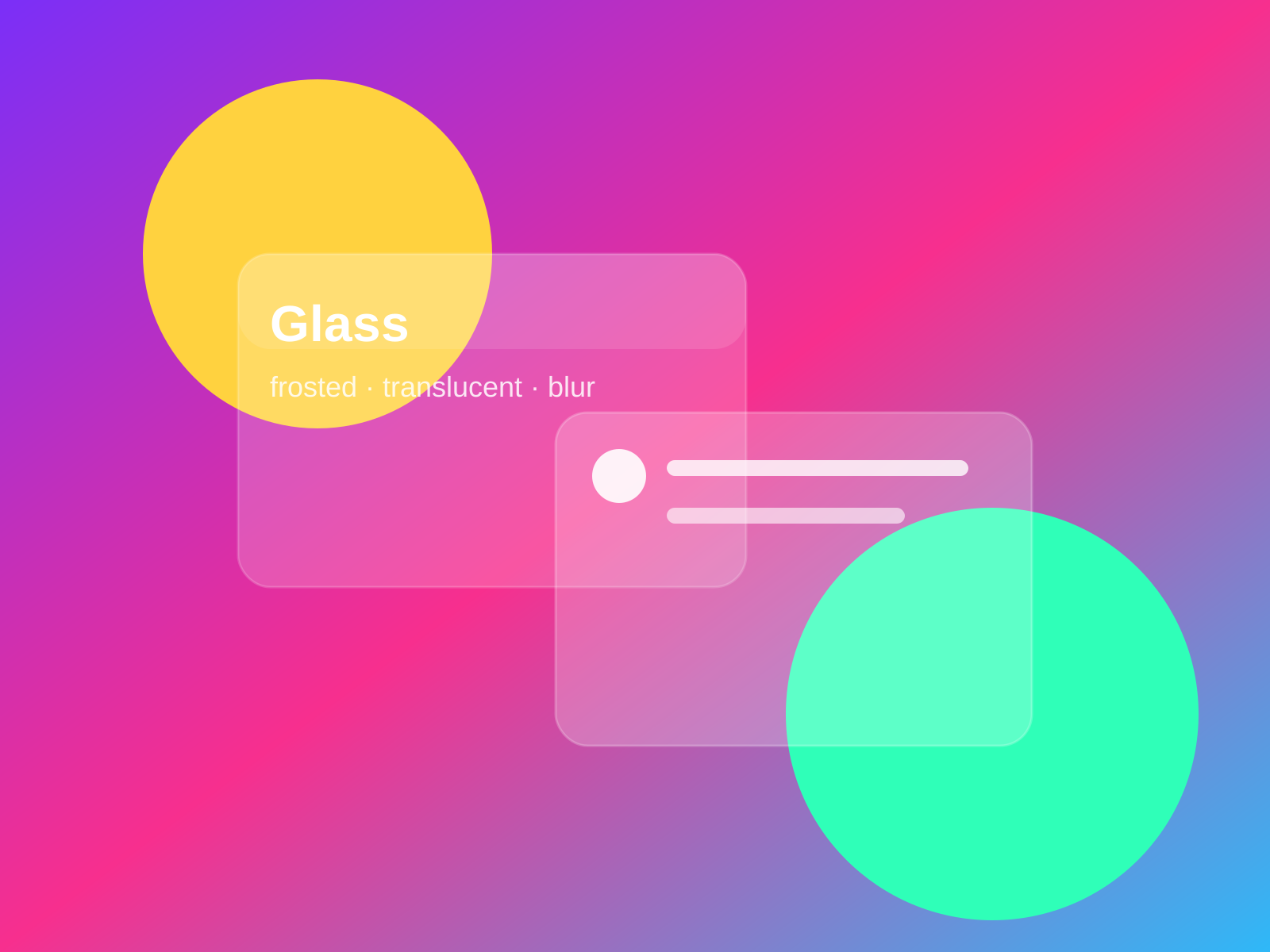
Glassmorphism
Frosted, translucent panels that blur whatever sits behind them, floating over vivid backdrops with thin light borders to suggest layered sheets of glass.
- Semi-transparent frosted panels
- Background blur of underlying content
- Thin, light, often gradient borders
- Vivid colorful backdrops behind glass
- Soft shadows implying floating layers
At a glance
| Flat Design | Glassmorphism | |
|---|---|---|
| Era | c. 2010–2017 | 2020s |
| Discipline | Graphic Design | Graphic Design |
| Region | Global | Global |
| Family | Digital, Corporate Modern | UI/Interface, Digital |
| Formal traits | flat-color, minimal, sans-serif, iconographic | translucent, frosted-blur, thin-border, layered |
More comparisons
Advertisement