Flat Design vs Material Design
Material Design evolved from Flat Design — answered flat design's ambiguity by reintroducing elevation, shadow, and motion.

Flat Design
The deliberately two-dimensional interface style that stripped away skeuomorphic shadows, gradients, and textures in favor of solid color, crisp icons, and clean typography.
- Solid, unshaded blocks of color with no gradients
- Removal of drop shadows, bevels, and skeuomorphic texture
- Simple geometric icons reduced to essential forms
- Clean sans-serif typography and generous whitespace
- Bright, often pastel or saturated flat color palettes
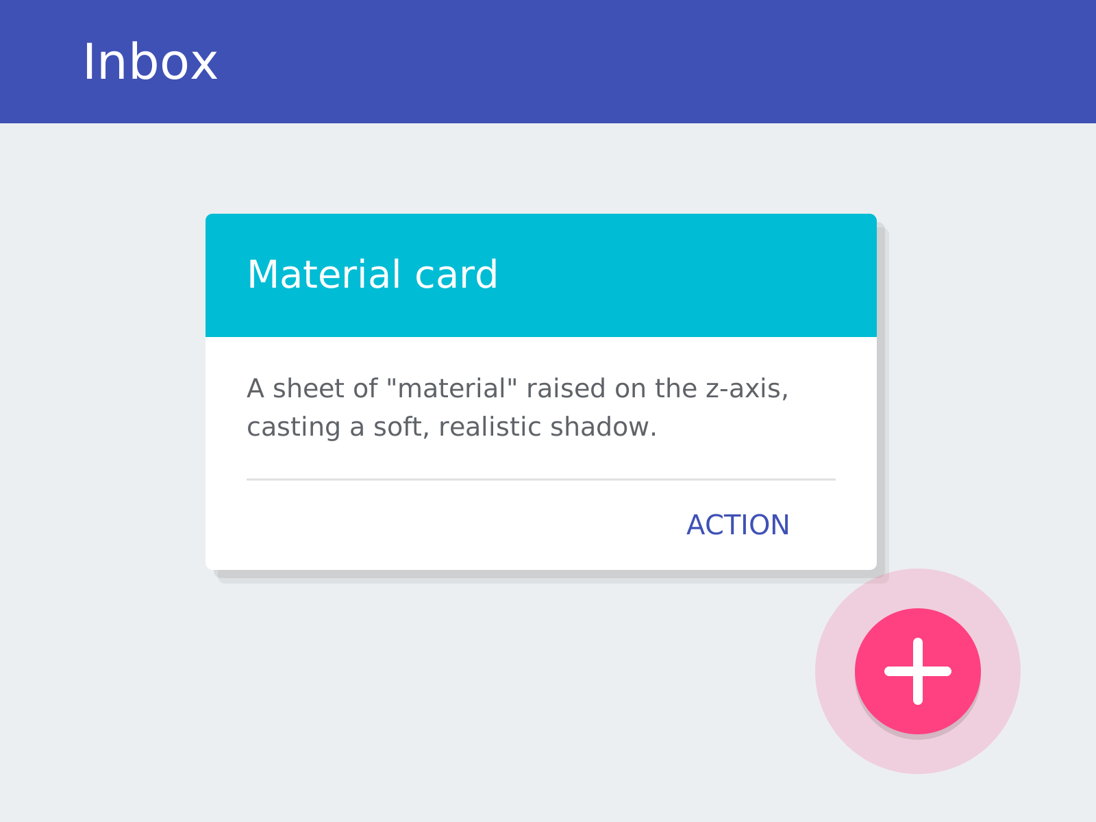
Material Design
Google's comprehensive design system that reimagines flat interfaces as sheets of digital 'material,' using elevation, realistic shadows, and physics-based motion to give pixels tangible behavior.
- Layered 'material' sheets with elevation on a z-axis
- Realistic soft shadows conveying depth and hierarchy
- Bold, intentional color and the Roboto typeface
- Physics-based, meaningful motion and ripple feedback
- Signature components like cards and the floating action button
At a glance
| Flat Design | Material Design | |
|---|---|---|
| Era | c. 2010–2017 | 2014–present |
| Discipline | Graphic Design | Graphic Design |
| Region | Global | Global |
| Family | Digital, Corporate Modern | Digital, Corporate Modern |
| Formal traits | flat-color, minimal, sans-serif, iconographic | elevation, soft-shadow, grid-based, motion-driven |
More comparisons
Advertisement