Monospace vs Slab Serif
Monospace was influenced by Slab Serif — Courier and kin pad narrow letters with slab serifs to fill the fixed cell.
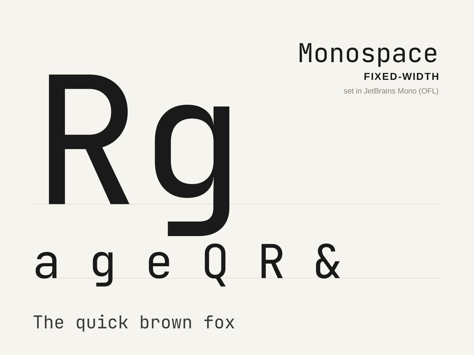
Monospace
The family in which every glyph occupies an identical horizontal width, descended from the mechanical typewriter and now the default voice of code. A narrow 'i' and a wide 'm' share the same cell, forcing distinctive design compromises.
- Every glyph advances an identical fixed width
- Wide spurs and serifs padding naturally narrow letters
- Condensed forms for naturally wide letters
- Strongly differentiated confusable characters
- Even horizontal rhythm aligning into columns
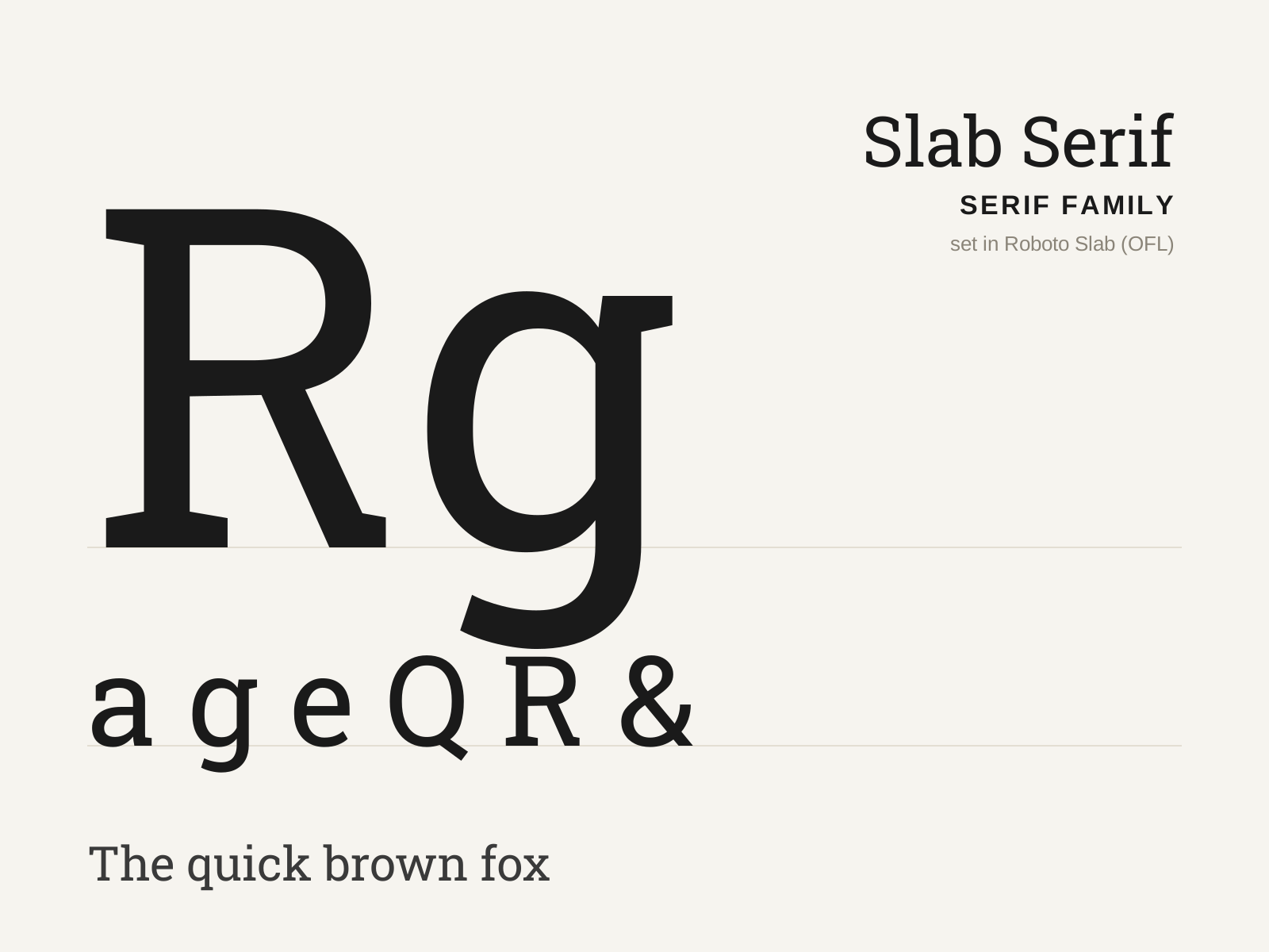
Slab Serif
Heavy, blocky serifs as thick as the stems, born for the bold demands of nineteenth-century advertising. Low contrast and squared-off, it shouts where the Didone whispers.
- Thick, square serifs nearly equal in weight to the stems
- Low stroke contrast, often near-monoline
- Bracketed (Clarendon) or unbracketed (geometric) serif joins
- Sturdy, even, mechanical proportions
- Large x-height with robust, blocky color
At a glance
| Monospace | Slab Serif | |
|---|---|---|
| Era | c. 1870–present | 1810s–1840s |
| Discipline | Typography | Typography |
| Region | United States, Global | England, United States |
| Family | Monospace | Serif |
| Formal traits | monospaced, fixed-width, even-rhythm, mechanical | slab-serif, low-contrast, monoline, vertical-stress |
More comparisons
Advertisement