Neo-grotesque Sans-serif vs Roboto
Roboto evolved from Neo-grotesque Sans-serif — a screen-tuned neo-grotesque with humanist touches.
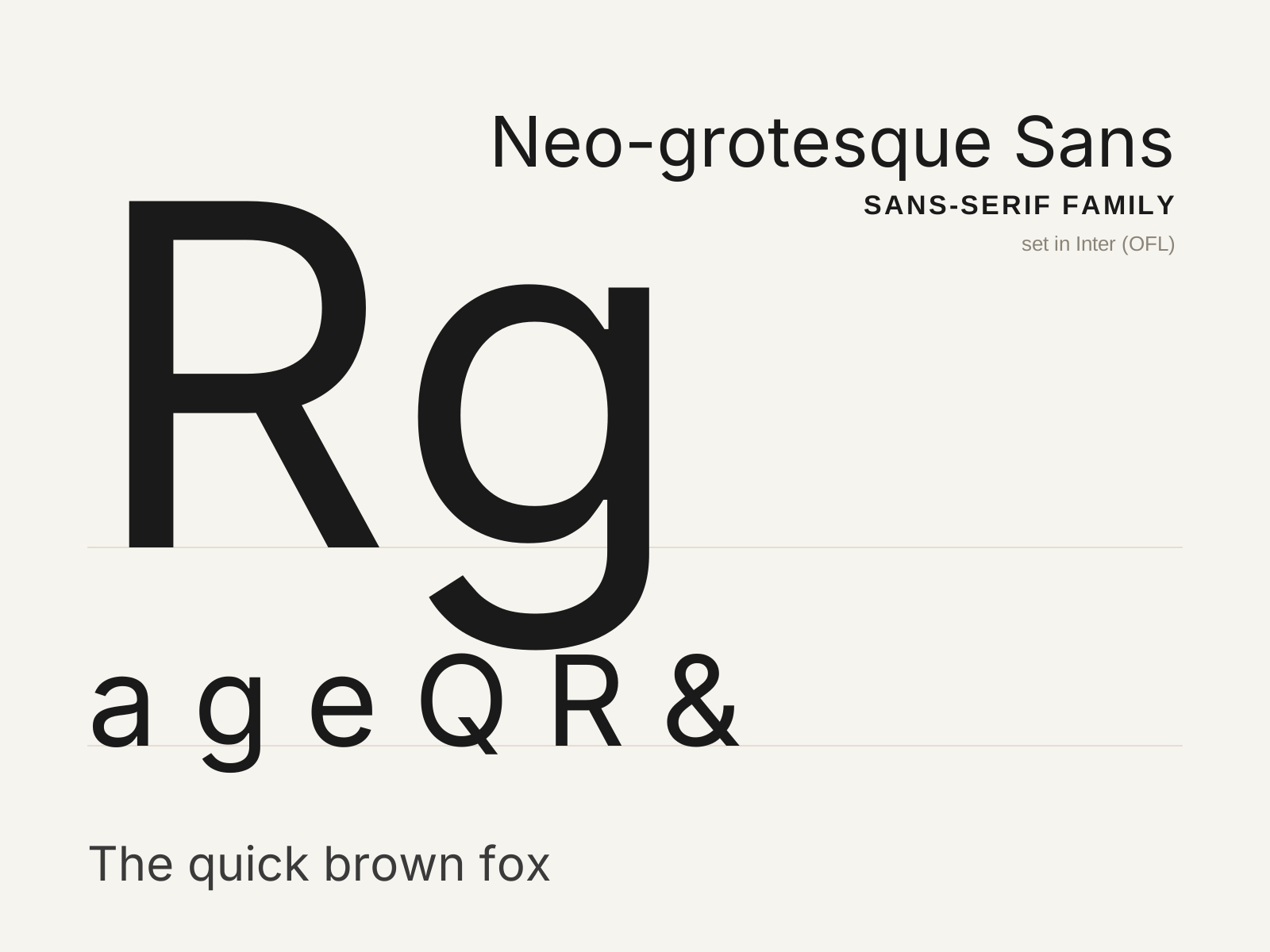
Neo-grotesque Sans-serif
The mid-century rationalization of the grotesque — the neutral, even, tightly fitted sans of Swiss modernism, engineered to disappear so the message could speak. Helvetica and Univers are its archetypes.
- Even, near-monoline strokes with minimal contrast
- High x-height with tight, even spacing
- Terminals sheared on strict horizontals and verticals
- Closed aperture and studied neutrality
- Curved, tucked R leg and gently squared bowls
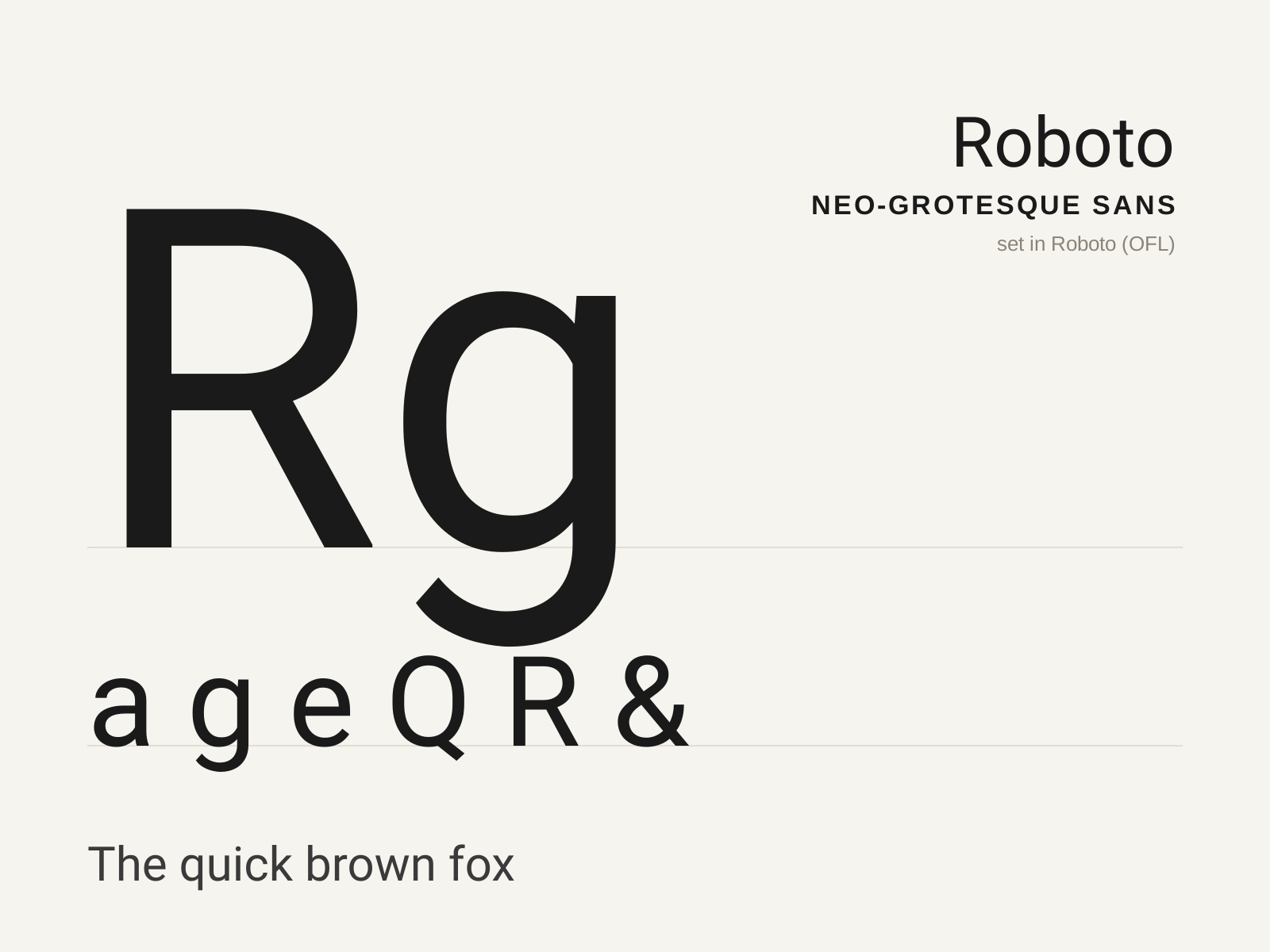
Roboto
Christian Robertson's 2011 typeface for Google's Android — a neo-grotesque skeleton loosened with humanist touches, engineered for screens and dubbed at launch a 'frankenfont' for its hybrid DNA.
- Neo-grotesque skeleton with humanist openings
- High x-height tuned for small-screen legibility
- Mix of straight and gently curved terminals
- Open apertures on c, e, s for clarity at size
- Double-story a and g of efficient, compact build
At a glance
| Neo-grotesque Sans-serif | Roboto | |
|---|---|---|
| Era | 1950s–1960s | 2011 |
| Discipline | Typography | Typography |
| Region | Switzerland, Germany, France | United States |
| Family | Sans-serif | Sans-serif |
| Formal traits | neo-grotesque, monoline, neutral, high-x-height | neo-grotesque, humanist, high-x-height, screen-optimized |
More comparisons
Advertisement