Material Design vs Roboto
Roboto is the cross-discipline counterpart of Material Design — the system face of Google Material Design.
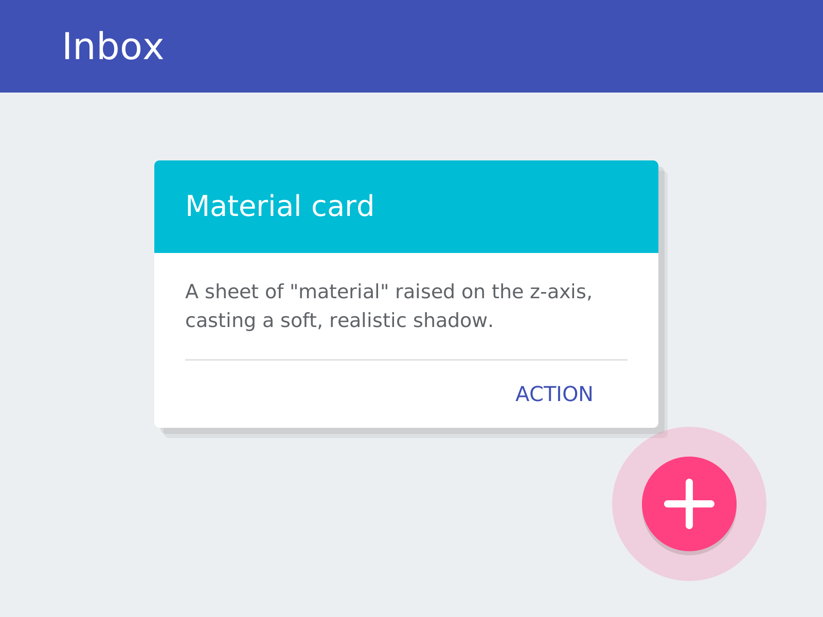
Material Design
Google's comprehensive design system that reimagines flat interfaces as sheets of digital 'material,' using elevation, realistic shadows, and physics-based motion to give pixels tangible behavior.
- Layered 'material' sheets with elevation on a z-axis
- Realistic soft shadows conveying depth and hierarchy
- Bold, intentional color and the Roboto typeface
- Physics-based, meaningful motion and ripple feedback
- Signature components like cards and the floating action button
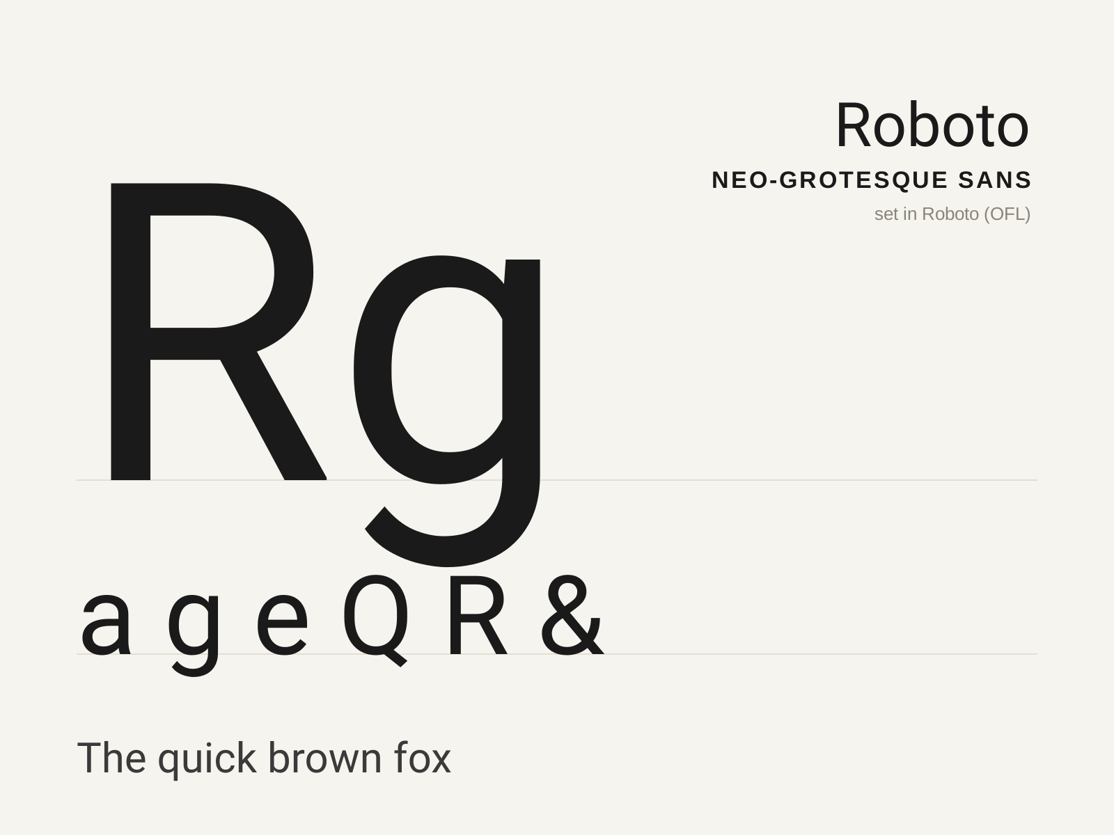
Roboto
Christian Robertson's 2011 typeface for Google's Android — a neo-grotesque skeleton loosened with humanist touches, engineered for screens and dubbed at launch a 'frankenfont' for its hybrid DNA.
- Neo-grotesque skeleton with humanist openings
- High x-height tuned for small-screen legibility
- Mix of straight and gently curved terminals
- Open apertures on c, e, s for clarity at size
- Double-story a and g of efficient, compact build
At a glance
| Material Design | Roboto | |
|---|---|---|
| Era | 2014–present | 2011 |
| Discipline | Graphic Design | Typography |
| Region | Global | United States |
| Family | Digital, Corporate Modern | Sans-serif |
| Formal traits | elevation, soft-shadow, grid-based, motion-driven | neo-grotesque, humanist, high-x-height, screen-optimized |
More comparisons
Advertisement