Times New Roman vs Transitional Serif
Times New Roman evolved from Transitional Serif.
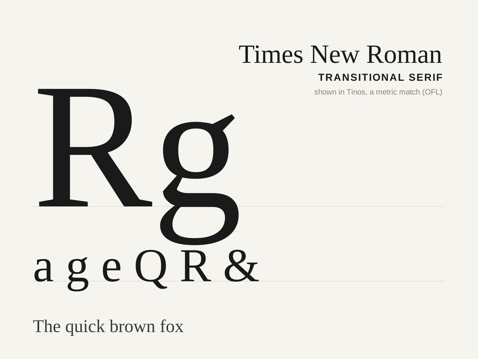
Times New Roman
The 1932 newspaper face commissioned for The Times of London under Stanley Morison and drawn by Victor Lardent — a compact, sharp, economical transitional serif that became the twentieth century's default.
- Relatively high contrast, near-vertical stress
- Sharp, pointed bracketed serifs
- Large x-height with condensed proportions
- Compact, economical character widths
- Sturdy, crisp forms tuned for small sizes
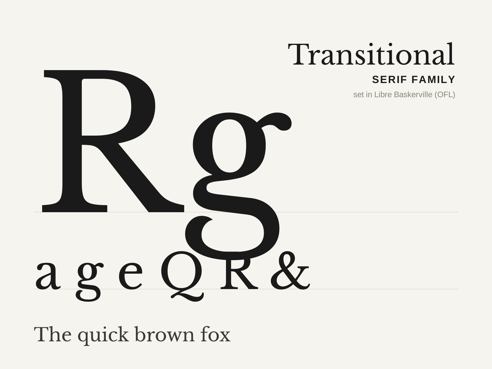
Transitional Serif
The bridge between the pen-formed old-styles and the rationalist Didones. Contrast sharpens and the axis swings toward vertical, yielding crisper, more even letterforms still warmed by bracketed serifs.
- Medium-to-high stroke contrast
- Near-vertical (slightly inclined) axis of stress
- Crisp, refined bracketed serifs
- More even, regular letter proportions than old-style
- Teardrop or sheared terminals on a, c, f
At a glance
| Times New Roman | Transitional Serif | |
|---|---|---|
| Era | 1932 | 1690s–1790s |
| Discipline | Typography | Typography |
| Region | England, London | France, England |
| Family | Serif | Serif |
| Formal traits | transitional, bracketed-serif, vertical-stress, high-contrast | transitional, bracketed-serif, vertical-stress, high-contrast |
More comparisons
Advertisement