Emigre Digital Type vs Postmodern Graphic Design
Emigre Digital Type was influenced by Postmodern Graphic Design.
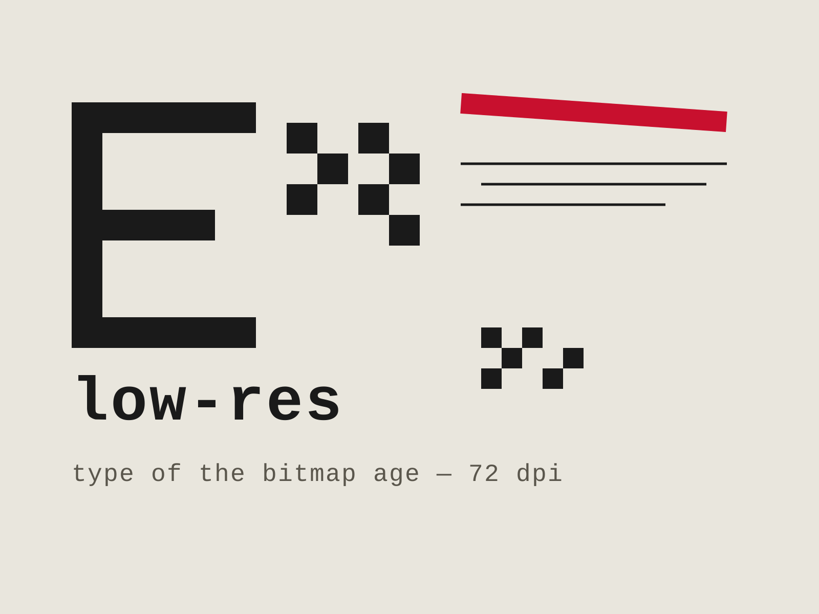
Emigre Digital Type
The pixel-embracing typography and deconstructed layouts of Emigre magazine, where the low-resolution Macintosh became a creative instrument rather than a limitation.
- Bitmap typefaces built on a coarse pixel grid
- Low-resolution Macintosh-era output
- Layered, rule-breaking editorial layouts
- Visible pixel staircase on letterforms
- Experimental, deconstructed typography

Postmodern Graphic Design
The rule-breaking reaction against rigid Swiss modernism, fracturing the grid with tilted type, layered transparency, and an embrace of complexity, ambiguity, and digital experimentation.
- Fractured grids with tilted and diagonal type axes
- Layered transparency and overlapping image planes
- Exaggerated, irregular letterspacing and stepped rules
- Early embrace of digital noise and Macintosh bitmap imagery
- Collision of disparate textures, patterns, and typefaces
At a glance
| Emigre Digital Type | Postmodern Graphic Design | |
|---|---|---|
| Era | 1980s–1990s | c. 1970s–1990s |
| Discipline | Graphic Design | Graphic Design |
| Region | United States | Switzerland, United States |
| Family | Digital, Typography | Postmodern, Digital |
| Formal traits | bitmap, low-resolution, layered, experimental | layered, tilted-type, letterspaced, grid-breaking |
More comparisons
Advertisement