Grunge Graphic Design vs Y2K Aesthetic
Y2K Aesthetic arose as a reaction against Grunge Graphic Design — answered 1990s grunge grime with glossy, optimistic polish.
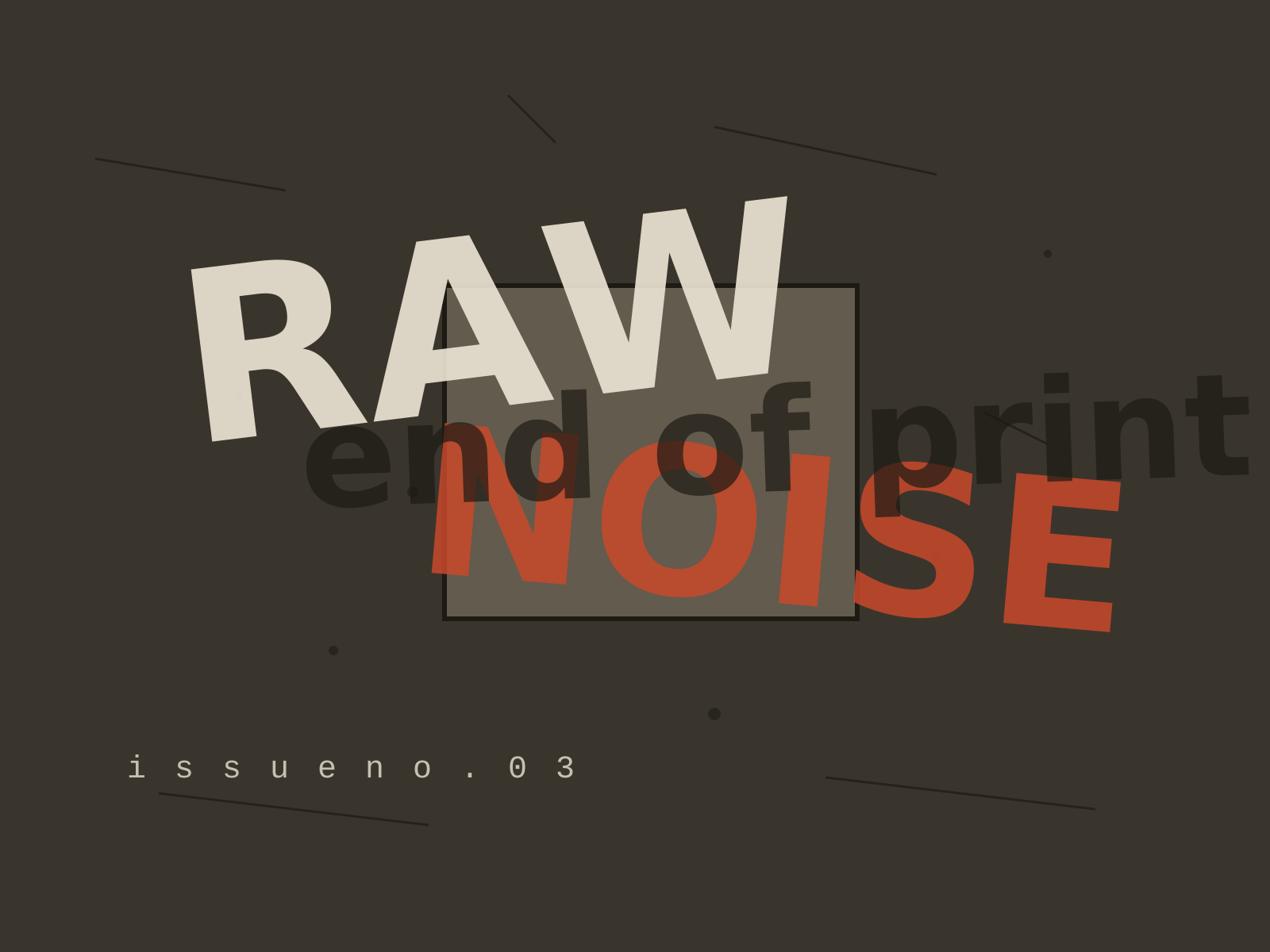
Grunge Graphic Design
The deconstructed, anti-legible typography of the 1990s, where text was layered, distressed, and shattered into texture in defiance of every readability rule.
- Layered, overlapping type pushed to near-illegibility
- Scanned grime, distressed textures, and photocopied dirt
- Shattered or abandoned grids and chaotic composition
- Torn, fragmented letterforms that bleed and overlap
- Expressive, intuitive layout over readability
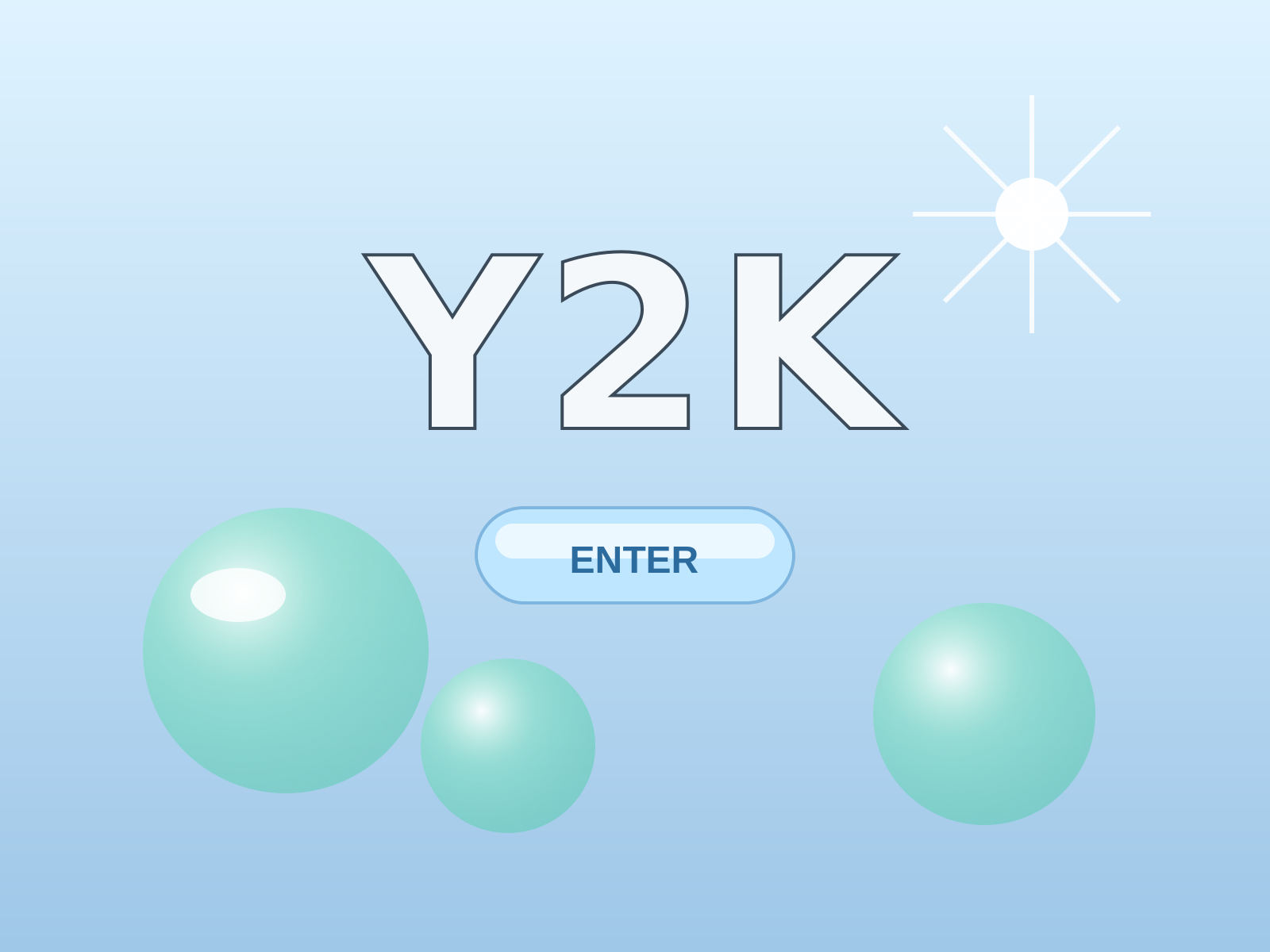
Y2K Aesthetic
The glossy techno-optimism of the turn of the millennium: liquid chrome, translucent bubble gadgets, lens flares, and a shiny faith that the digital future would be frictionless and fun.
- Liquid chrome and mirror-finish metallic type
- Translucent, candy-colored bubble plastics and gadgets
- Lens flares, starbursts, and glossy reflective highlights
- Cool palette of silver, ice blue, and acid green
- Soft 3D bevels, blobby organic shapes, and glassy buttons
At a glance
| Grunge Graphic Design | Y2K Aesthetic | |
|---|---|---|
| Era | c. 1990–1999 | c. 1997–2004 |
| Discipline | Graphic Design | Graphic Design |
| Region | United States, United Kingdom | Global, United States, Japan |
| Family | Postmodern, Digital | Digital, Vernacular/Pop |
| Formal traits | distressed, layered, grid-breaking, anti-legible | chrome, translucent, gradient, lens-flare |
More comparisons
Advertisement