Grunge Graphic Design vs Swiss Style
Grunge Graphic Design arose as a reaction against Swiss Style — the antithesis of Swiss legibility — readability treated as optional.
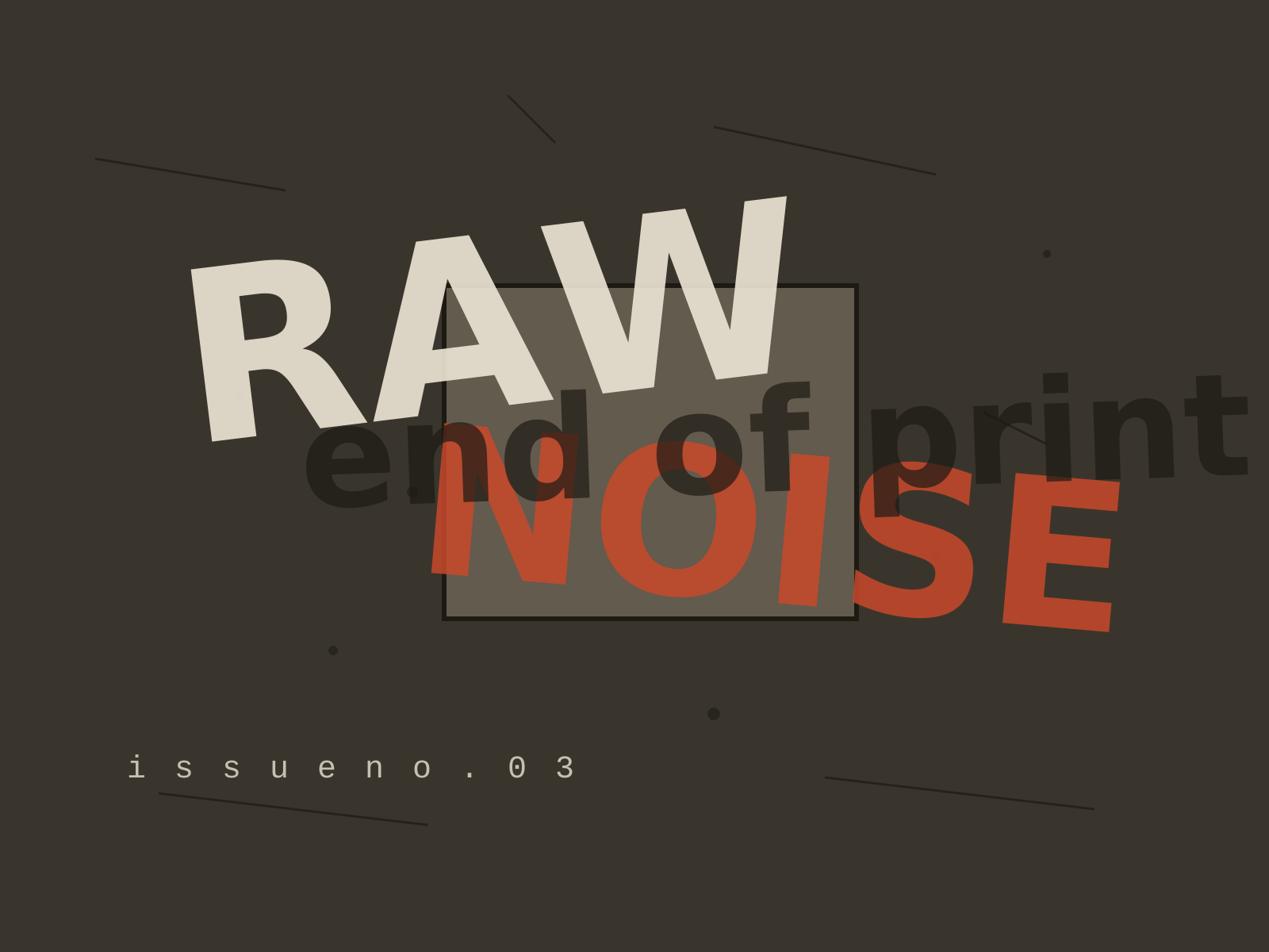
Grunge Graphic Design
The deconstructed, anti-legible typography of the 1990s, where text was layered, distressed, and shattered into texture in defiance of every readability rule.
- Layered, overlapping type pushed to near-illegibility
- Scanned grime, distressed textures, and photocopied dirt
- Shattered or abandoned grids and chaotic composition
- Torn, fragmented letterforms that bleed and overlap
- Expressive, intuitive layout over readability
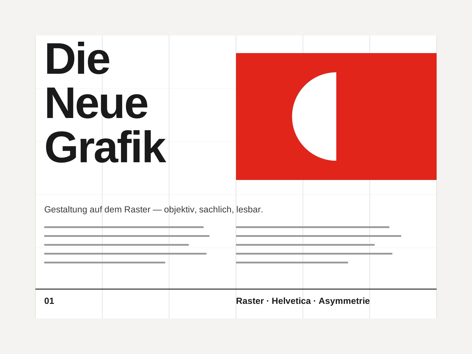
Swiss Style
The mid-century gospel of objective design — mathematical grids, flush-left ragged-right sans-serif type (Helvetica, Akzidenz-Grotesk), generous white space, and photography in place of illustration.
- Mathematical modular grid underlying every element
- Neo-grotesque sans-serif type (Helvetica, Akzidenz-Grotesk)
- Flush-left, ragged-right text setting
- Asymmetric layout balanced by generous white space
- Objective photography instead of illustration
At a glance
| Grunge Graphic Design | Swiss Style | |
|---|---|---|
| Era | c. 1990–1999 | 1950s–1970s |
| Discipline | Graphic Design | Graphic Design |
| Region | United States, United Kingdom | Switzerland, Germany, International |
| Family | Postmodern, Digital | Modernist, International |
| Formal traits | distressed, layered, grid-breaking, anti-legible | grid-based, sans-serif, asymmetric, minimal |
More comparisons
Advertisement