Grunge Graphic Design vs Postmodern Graphic Design
Grunge Graphic Design evolved from Postmodern Graphic Design — took New Wave's broken grid into full digital deconstruction.
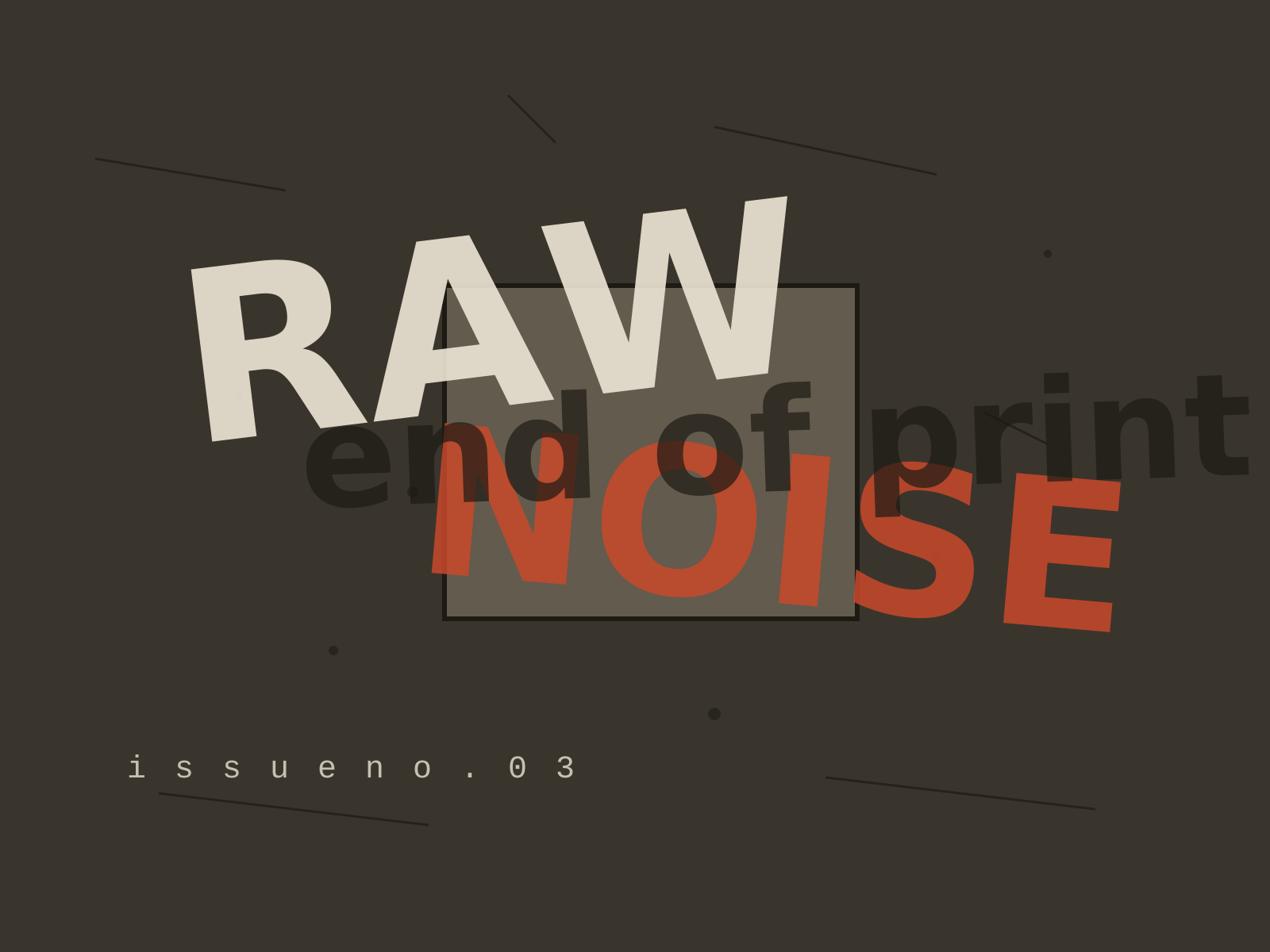
Grunge Graphic Design
The deconstructed, anti-legible typography of the 1990s, where text was layered, distressed, and shattered into texture in defiance of every readability rule.
- Layered, overlapping type pushed to near-illegibility
- Scanned grime, distressed textures, and photocopied dirt
- Shattered or abandoned grids and chaotic composition
- Torn, fragmented letterforms that bleed and overlap
- Expressive, intuitive layout over readability
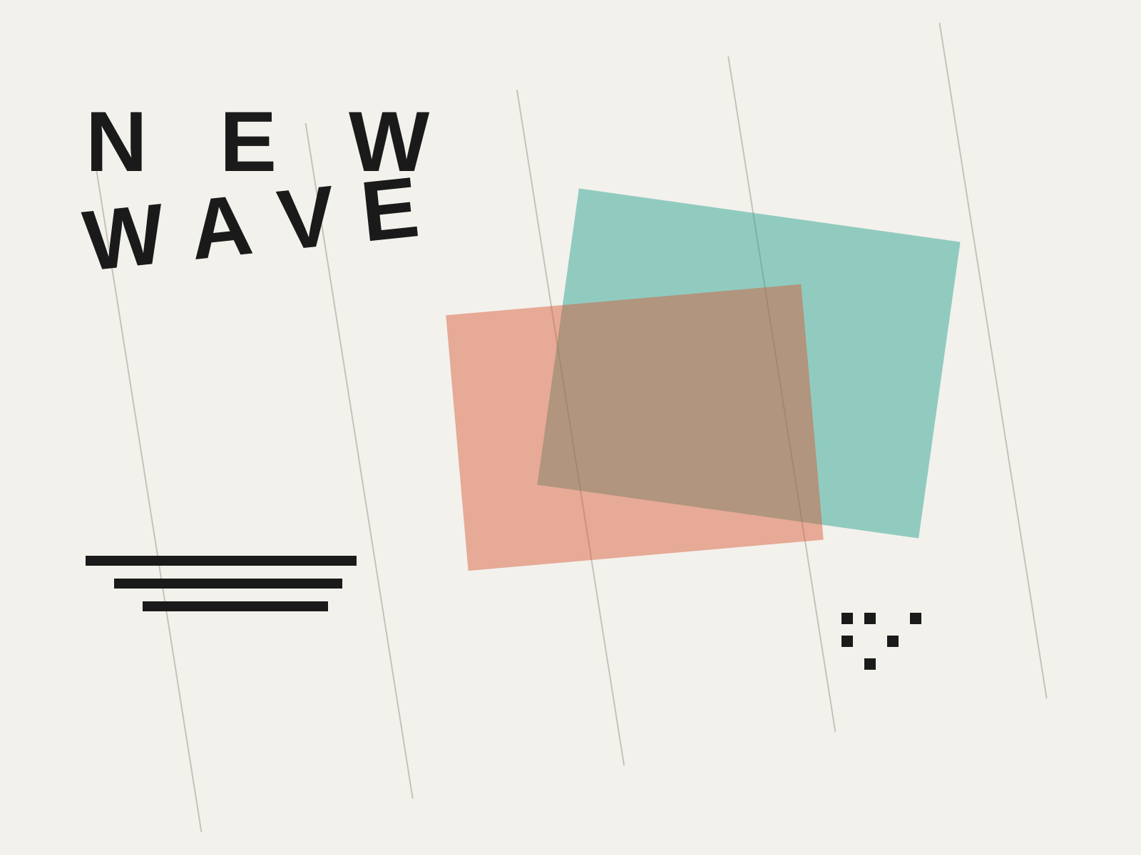
Postmodern Graphic Design
The rule-breaking reaction against rigid Swiss modernism, fracturing the grid with tilted type, layered transparency, and an embrace of complexity, ambiguity, and digital experimentation.
- Fractured grids with tilted and diagonal type axes
- Layered transparency and overlapping image planes
- Exaggerated, irregular letterspacing and stepped rules
- Early embrace of digital noise and Macintosh bitmap imagery
- Collision of disparate textures, patterns, and typefaces
At a glance
| Grunge Graphic Design | Postmodern Graphic Design | |
|---|---|---|
| Era | c. 1990–1999 | c. 1970s–1990s |
| Discipline | Graphic Design | Graphic Design |
| Region | United States, United Kingdom | Switzerland, United States |
| Family | Postmodern, Digital | Postmodern, Digital |
| Formal traits | distressed, layered, grid-breaking, anti-legible | layered, tilted-type, letterspaced, grid-breaking |
More comparisons
Advertisement