Modernist Logo Design vs Mid-Century Modern Graphic Design
Modernist Logo Design evolved from Mid-Century Modern Graphic Design — the trademark wing of postwar American modernism.
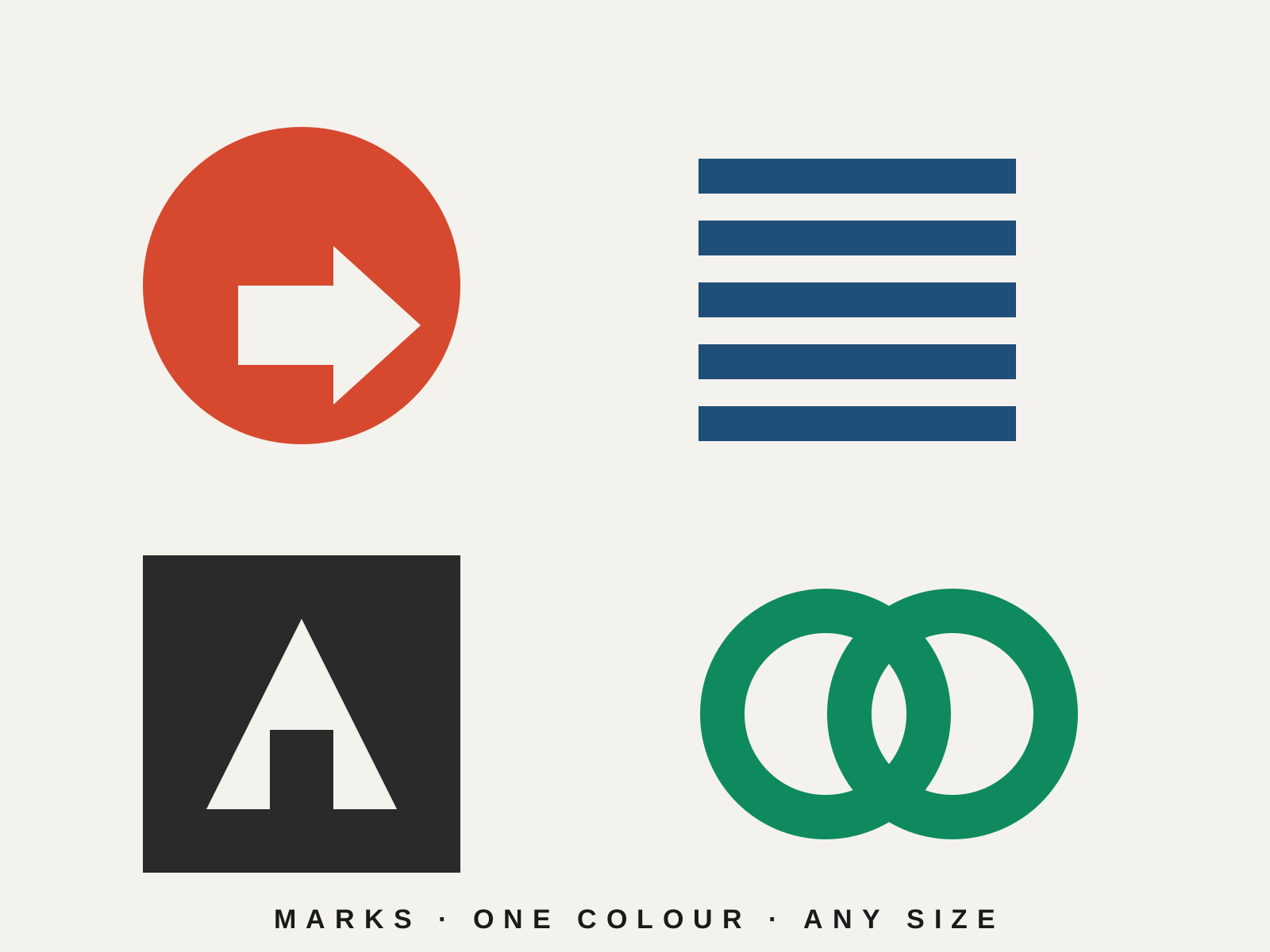
Modernist Logo Design
Reductive, geometric trademarks distilled to their simplest memorable form: clean abstract marks and refined logotypes for the corporate age. Timeless, scalable symbols built on modernist clarity.
- Reductive, simplified geometric construction
- Abstract symbol or refined logotype
- Flat, often single-color execution
- Deliberate use of negative space
- Scalable, memorable, reproduction-friendly form
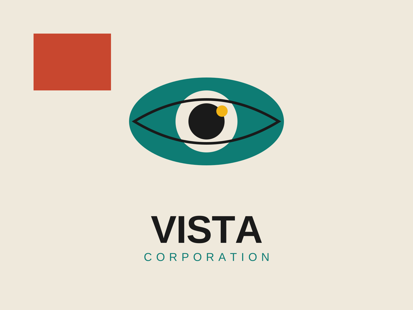
Mid-Century Modern Graphic Design
Postwar American graphic design that married European modernist rigor with Madison Avenue optimism, building the visual language of the corporate logo, the trademark, and the witty conceptual poster.
- Reductive conceptual logos built around a single idea
- Hand-cut paper collage and torn-edge shapes
- Flat unmodeled color blocks with generous white space
- Bold sans-serif type set with dramatic scale contrast
- Geometric simplification of imagery into clean silhouettes
At a glance
| Modernist Logo Design | Mid-Century Modern Graphic Design | |
|---|---|---|
| Era | 1950s–1970s | c. 1945–1970 |
| Discipline | Graphic Design | Graphic Design |
| Region | United States, International | United States |
| Family | Modernist | Corporate Modern, Modernist |
| Formal traits | reductive, geometric, flat-color, negative-space | flat-color, geometric, sans-serif, negative-space |
More comparisons
Advertisement