Mid-Century Modern Graphic Design vs Plakatstil
Mid-Century Modern Graphic Design was influenced by Plakatstil — inherited the reductive object-poster logic and the integrated logotype.
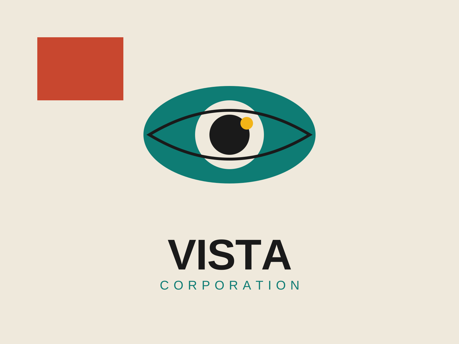
Mid-Century Modern Graphic Design
Postwar American graphic design that married European modernist rigor with Madison Avenue optimism, building the visual language of the corporate logo, the trademark, and the witty conceptual poster.
- Reductive conceptual logos built around a single idea
- Hand-cut paper collage and torn-edge shapes
- Flat unmodeled color blocks with generous white space
- Bold sans-serif type set with dramatic scale contrast
- Geometric simplification of imagery into clean silhouettes
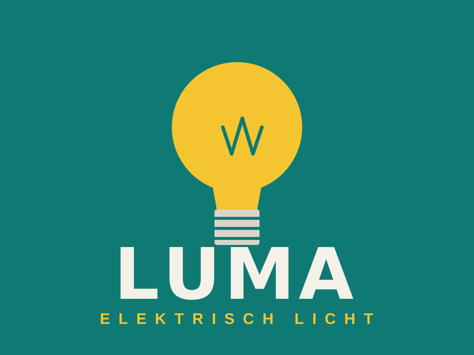
Plakatstil
A radically reductive German poster style that strips the advertisement to a single product, a brand name, and a flat field of color — the 'object poster' that founded modern advertising design.
- Single isolated product as the subject
- Flat, unmodulated background color
- Bold custom brand logotype
- Elimination of ornament and depth
- High-contrast legibility at a glance
At a glance
| Mid-Century Modern Graphic Design | Plakatstil | |
|---|---|---|
| Era | c. 1945–1970 | 1905–1920s |
| Discipline | Graphic Design | Graphic Design |
| Region | United States | Germany |
| Family | Corporate Modern, Modernist | Modernist, Poster |
| Formal traits | flat-color, geometric, sans-serif, negative-space | flat-color, reductive, custom-lettering, high-contrast |
More comparisons
- Mid-Century Modern vs Mid-Century Modern Graphic Design
- Bauhaus Graphic Design vs Mid-Century Modern Graphic Design
- Art Deco Graphics vs Mid-Century Modern Graphic Design
- Modernist Logo Design vs Mid-Century Modern Graphic Design
- Art Nouveau (Graphic) vs Plakatstil
- Plakatstil vs Vienna Secession Graphics
Advertisement