Material Design vs Swiss Style
Material Design was influenced by Swiss Style — kept the Swiss baseline grid, bold colour, and clean sans-serif type.
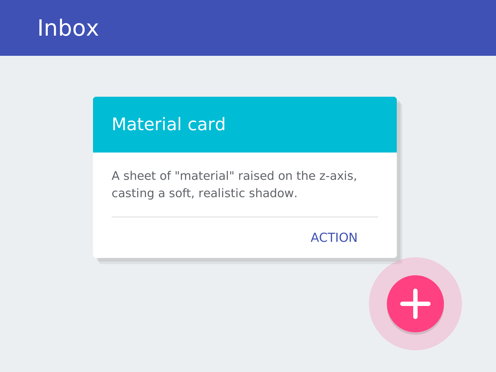
Material Design
Google's comprehensive design system that reimagines flat interfaces as sheets of digital 'material,' using elevation, realistic shadows, and physics-based motion to give pixels tangible behavior.
- Layered 'material' sheets with elevation on a z-axis
- Realistic soft shadows conveying depth and hierarchy
- Bold, intentional color and the Roboto typeface
- Physics-based, meaningful motion and ripple feedback
- Signature components like cards and the floating action button
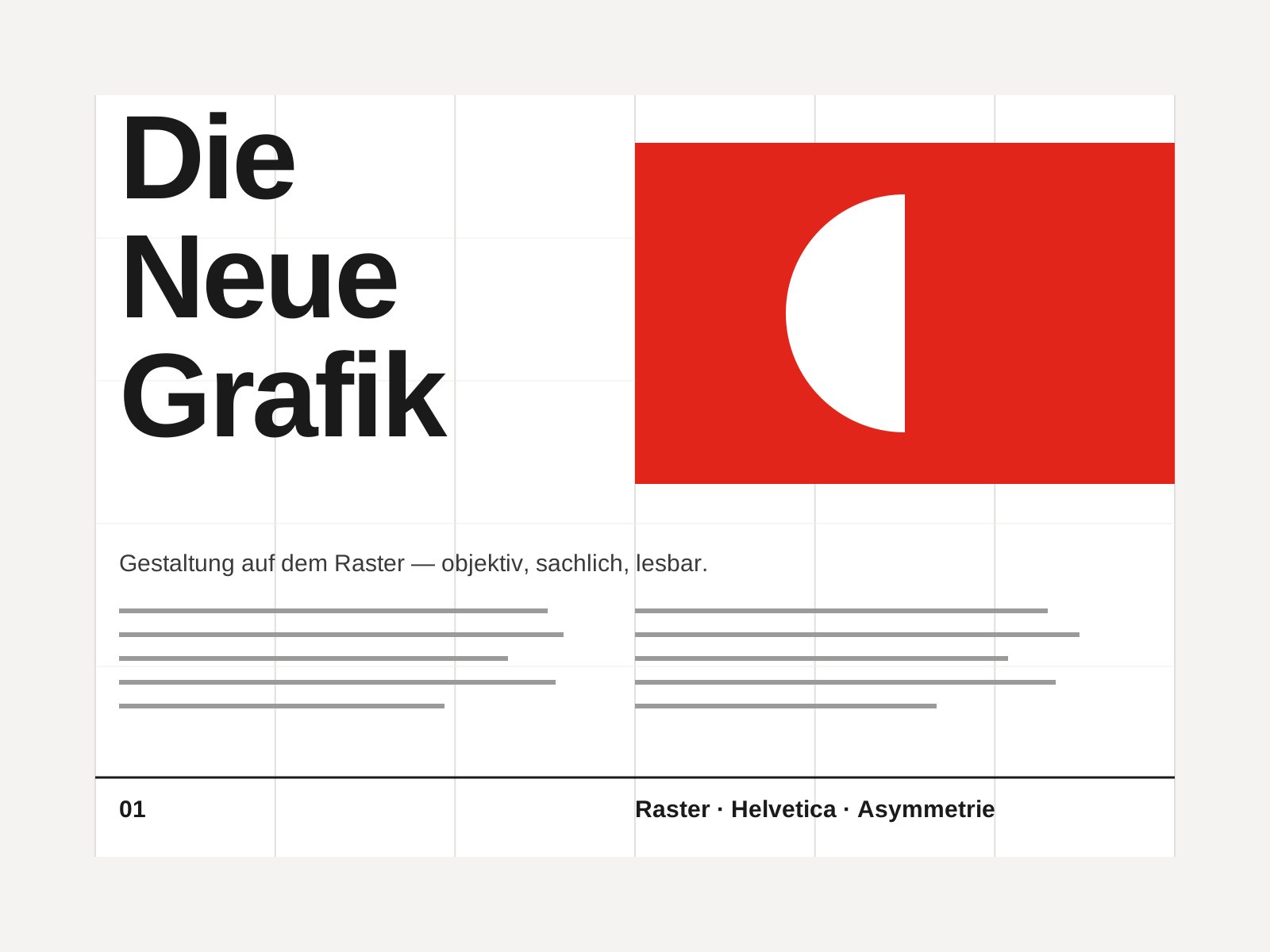
Swiss Style
The mid-century gospel of objective design — mathematical grids, flush-left ragged-right sans-serif type (Helvetica, Akzidenz-Grotesk), generous white space, and photography in place of illustration.
- Mathematical modular grid underlying every element
- Neo-grotesque sans-serif type (Helvetica, Akzidenz-Grotesk)
- Flush-left, ragged-right text setting
- Asymmetric layout balanced by generous white space
- Objective photography instead of illustration
At a glance
| Material Design | Swiss Style | |
|---|---|---|
| Era | 2014–present | 1950s–1970s |
| Discipline | Graphic Design | Graphic Design |
| Region | Global | Switzerland, Germany, International |
| Family | Digital, Corporate Modern | Modernist, International |
| Formal traits | elevation, soft-shadow, grid-based, motion-driven | grid-based, sans-serif, asymmetric, minimal |
More comparisons
Advertisement