Pictogram & Wayfinding Systems vs Swiss Style
Pictogram & Wayfinding Systems was influenced by Swiss Style.
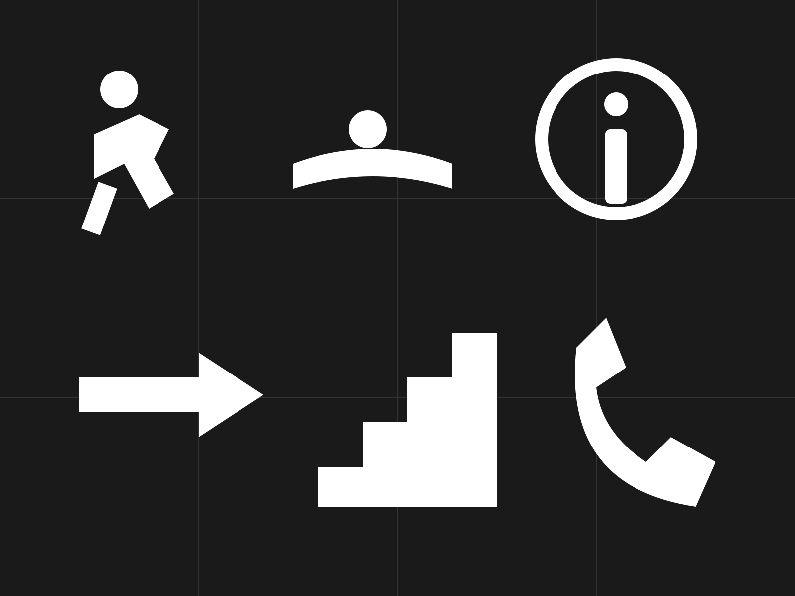
Pictogram & Wayfinding Systems
Coordinated families of geometric figures for signage and wayfinding, built on a shared grid so every symbol reads as one consistent system. Reductive, universal pictograms that guide crowds without words.
- Coordinated symbol family on a shared grid
- Geometric figures from verticals, horizontals, 45° diagonals
- Reductive, jointless silhouette figures
- Consistent stroke weight and proportion
- Optimized for distance and small-size legibility
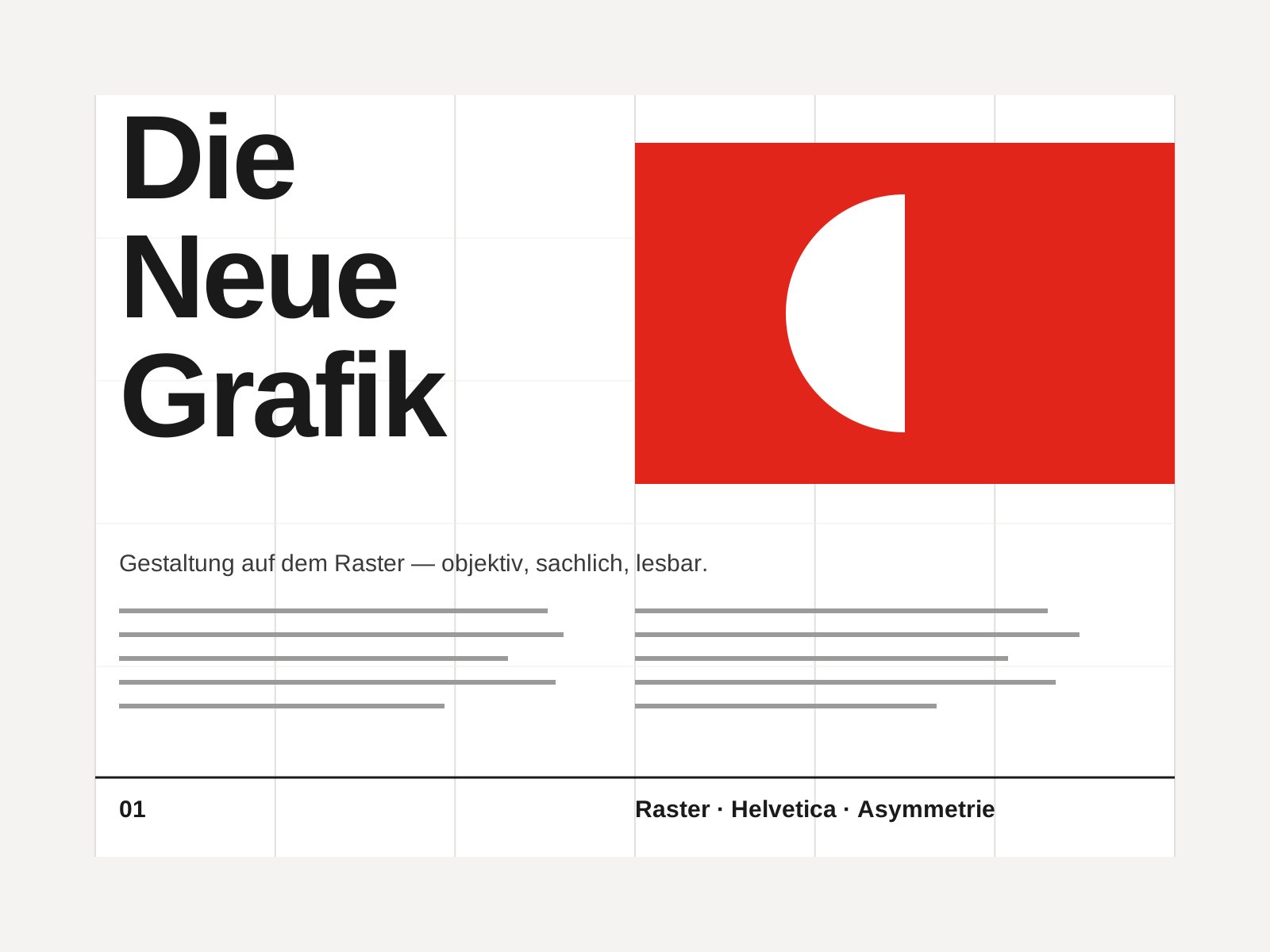
Swiss Style
The mid-century gospel of objective design — mathematical grids, flush-left ragged-right sans-serif type (Helvetica, Akzidenz-Grotesk), generous white space, and photography in place of illustration.
- Mathematical modular grid underlying every element
- Neo-grotesque sans-serif type (Helvetica, Akzidenz-Grotesk)
- Flush-left, ragged-right text setting
- Asymmetric layout balanced by generous white space
- Objective photography instead of illustration
At a glance
| Pictogram & Wayfinding Systems | Swiss Style | |
|---|---|---|
| Era | 1960s–1980s | 1950s–1970s |
| Discipline | Graphic Design | Graphic Design |
| Region | Germany, United States, International | Switzerland, Germany, International |
| Family | Systems/Wayfinding | Modernist, International |
| Formal traits | pictographic, grid-based, geometric, systematic | grid-based, sans-serif, asymmetric, minimal |
More comparisons
Advertisement