Risograph vs Swiss Style
Risograph was influenced by Swiss Style.
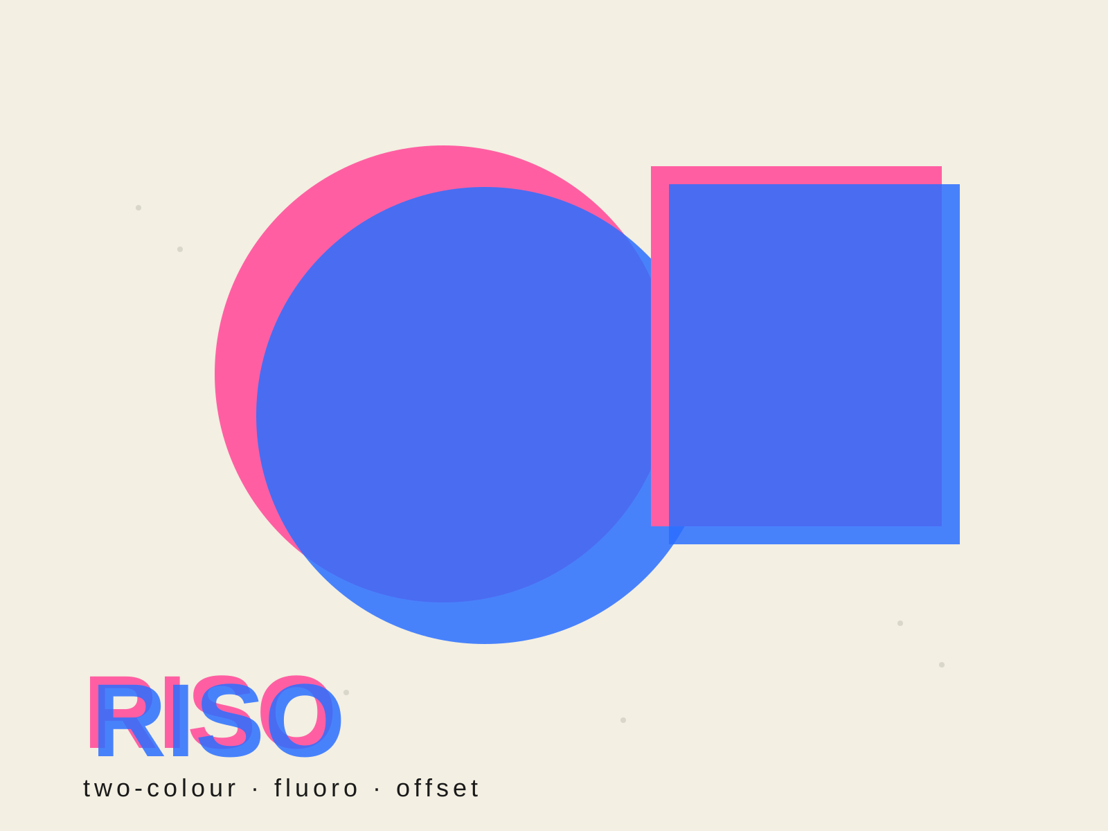
Risograph
A spot-color printing aesthetic built on the Risograph duplicator's soy-based fluorescent inks, where deliberate misregistration, grain, and overprinted layers turn mechanical limitation into charm.
- Limited spot-color (often duotone) palettes
- Fluorescent inks—hot pink, fluoro orange, blue
- Visible misregistration between color layers
- Grainy halftone dot texture
- Overprinted layers blending into new colors
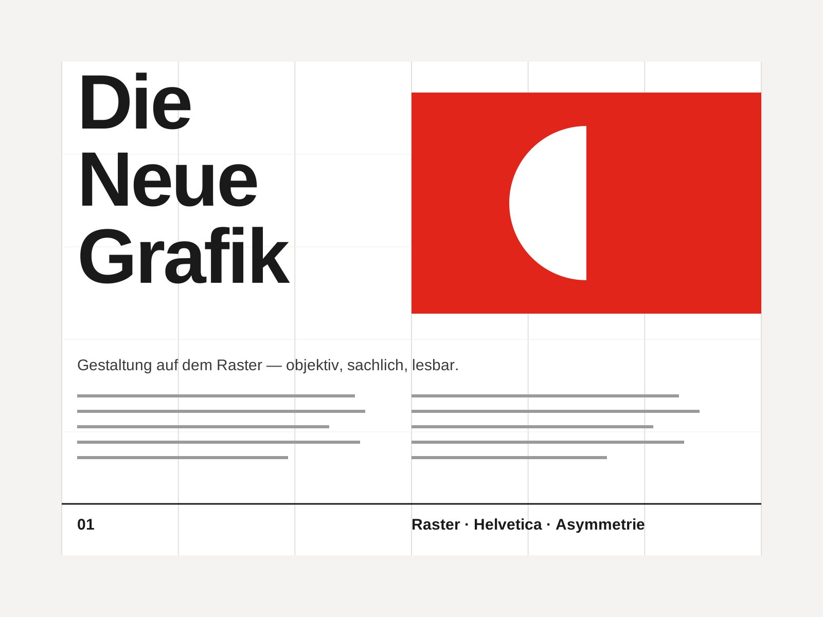
Swiss Style
The mid-century gospel of objective design — mathematical grids, flush-left ragged-right sans-serif type (Helvetica, Akzidenz-Grotesk), generous white space, and photography in place of illustration.
- Mathematical modular grid underlying every element
- Neo-grotesque sans-serif type (Helvetica, Akzidenz-Grotesk)
- Flush-left, ragged-right text setting
- Asymmetric layout balanced by generous white space
- Objective photography instead of illustration
At a glance
| Risograph | Swiss Style | |
|---|---|---|
| Era | Contemporary | 1950s–1970s |
| Discipline | Graphic Design | Graphic Design |
| Region | Japan, Europe, North America, Global | Switzerland, Germany, International |
| Family | DIY/Subculture, Digital | Modernist, International |
| Formal traits | spot-color, fluorescent, misregistered, grainy | grid-based, sans-serif, asymmetric, minimal |
More comparisons
Advertisement