Supergraphics vs Swiss Style
Supergraphics was influenced by Swiss Style — hard-edged Swiss form blown up to architectural scale.
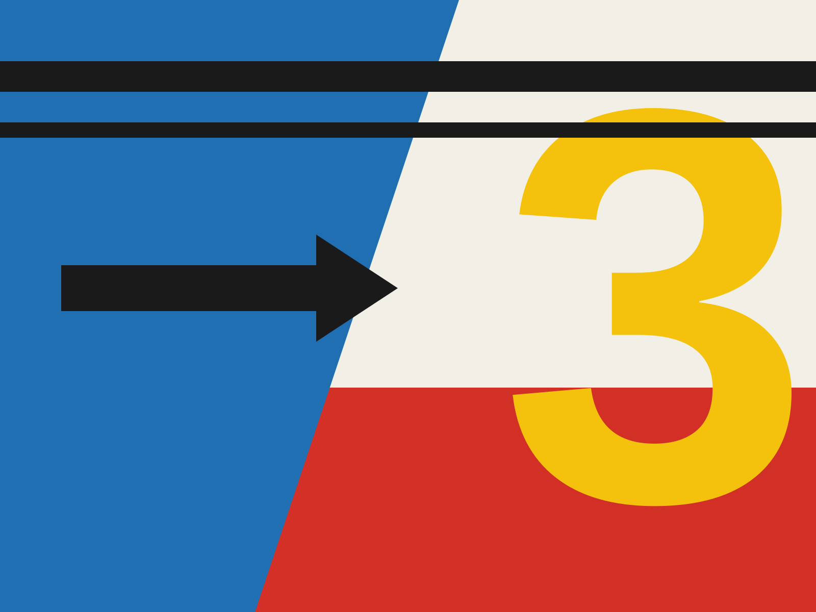
Supergraphics
Enormous, bold typographic and geometric forms painted directly onto walls and buildings, scaled to architecture itself. Hard-edged color shapes and giant letters that reshape how a space is perceived.
- Oversized type and geometry at architectural scale
- Flat planes of hard-edged saturated color
- Forms wrapping walls, corners, and whole facades
- Bold stripes, arrows, numerals, and circles
- Graphics that visually restructure the space
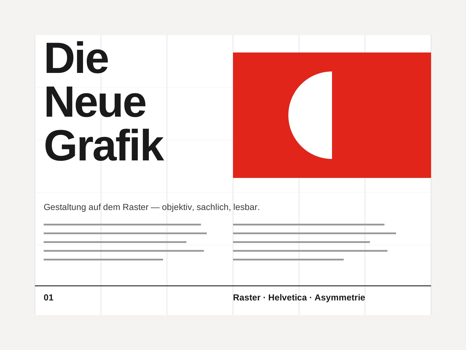
Swiss Style
The mid-century gospel of objective design — mathematical grids, flush-left ragged-right sans-serif type (Helvetica, Akzidenz-Grotesk), generous white space, and photography in place of illustration.
- Mathematical modular grid underlying every element
- Neo-grotesque sans-serif type (Helvetica, Akzidenz-Grotesk)
- Flush-left, ragged-right text setting
- Asymmetric layout balanced by generous white space
- Objective photography instead of illustration
At a glance
| Supergraphics | Swiss Style | |
|---|---|---|
| Era | 1960s–1970s | 1950s–1970s |
| Discipline | Graphic Design | Graphic Design |
| Region | United States | Switzerland, Germany, International |
| Family | Modernist | Modernist, International |
| Formal traits | large-scale, flat-color, geometric, architectural | grid-based, sans-serif, asymmetric, minimal |
More comparisons
Advertisement