Japanese Postwar Graphic vs Swiss Style
Japanese Postwar Graphic was influenced by Swiss Style.
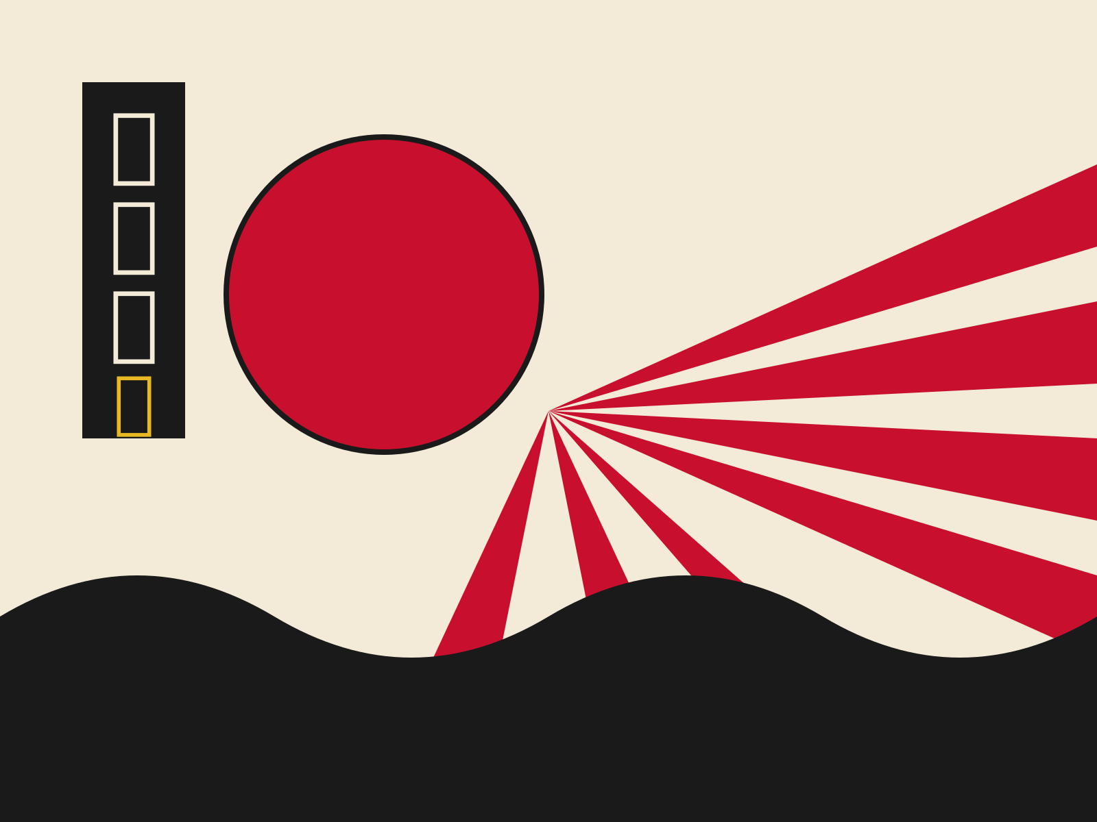
Japanese Postwar Graphic
The postwar generation of Japanese designers who fused Bauhaus rationalism with native tradition and Pop exuberance. From Kamekura's geometric clarity to Yokoo's psychedelic collage, it forged a distinctly Japanese modernism.
- Geometric clarity fused with Japanese motifs
- Flat planes and stylized faces from ukiyo-e and Noh
- Bold, saturated, often symbolic color
- Psychedelic collage and vernacular imagery (Yokoo)
- Disciplined modernist grid and typography
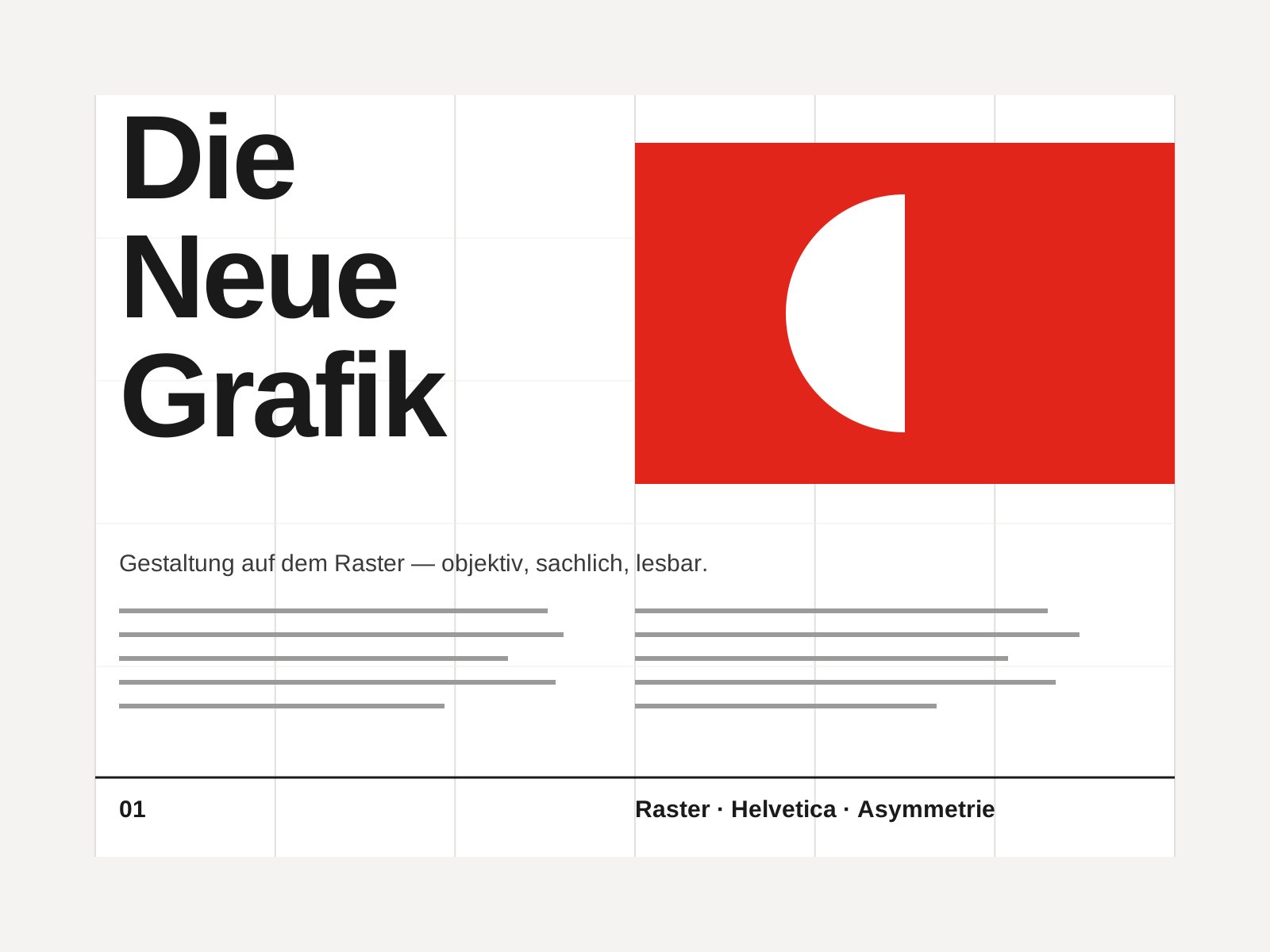
Swiss Style
The mid-century gospel of objective design — mathematical grids, flush-left ragged-right sans-serif type (Helvetica, Akzidenz-Grotesk), generous white space, and photography in place of illustration.
- Mathematical modular grid underlying every element
- Neo-grotesque sans-serif type (Helvetica, Akzidenz-Grotesk)
- Flush-left, ragged-right text setting
- Asymmetric layout balanced by generous white space
- Objective photography instead of illustration
At a glance
| Japanese Postwar Graphic | Swiss Style | |
|---|---|---|
| Era | 1950s–1980s | 1950s–1970s |
| Discipline | Graphic Design | Graphic Design |
| Region | Japan | Switzerland, Germany, International |
| Family | World, Poster | Modernist, International |
| Formal traits | flat-color, geometric, collage, modernist | grid-based, sans-serif, asymmetric, minimal |
More comparisons
Advertisement